Author Archives: FSF87

About FSF87

It's been a long-running mystery as to what "FSF87" means. Obviously, the "87" is my year of birth; however, I made it a guessing game on my profile as to what the "FSF" part stood for. It was a nice little conversation starter. Women used to message me all the time with guesses (no one got it right). I still like to keep people guessing, so I won't fully explain what it means here, just that it's short for the title of a 1998 album by an alternative rock/post-grunge band from Minneapolis. I picked the name when I signed up to OkCupid in 2006 because I was going through a bit of a post-grunge phase and it seemed appropriate. After I signed up to OkCupid, I didn't use it for a few years because I ended up falling into a long-term relationship (thanks to MySpace). However, when I came back to OkCupid in 2010, I loved every aspect of it. It was a great way to meet new friends, and it took me around the world and back (metaphorically and literally). Unfortunately, after Match Group bought the site in 2011, they ruined it. So I've made it my mission here to expose the bad business practices of Match Group with all of its intellectual properties, not just OkCupid. I'm the owner of this site, as well as the main (and currently only) blogger here.

Strict Mode

Recently, I’ve seen a lot of people in r/OkCupid complaining about OKC ignoring their preferences (mainly search radius) and showing their profile to people all over the world. Now, far be it from me to come to Match Group’s defence, but OKC is not ignoring your preferences; you just don’t understand how preferences work (and have always worked).

It’s really quite simple.

Your preferences are YOUR preferences alone, not anyone else’s.

They determine which profiles the platform shows YOU.

Other people have their own preferences, which determine which profiles the platform shows them.

If you match someone else’s preferences, but they don’t match yours, OKC will still show your profile to them. Equally, if someone matches your preferences, but you don’t match theirs, OKC will still show their profile to you.

It’s always been this way.

A little over twelve years ago, I received a message on OKC from a woman in Tel Aviv, despite my search radius being set to no more than 250 miles (Tel Aviv, for the record, is over 2,200 miles away from where I was living at the time).

And it’s the same on every platform.

Okay, Plenty of Fish is an exception because it does just outright ignore your preferences and shows you people outside of your preferences (as documented here).

The platforms only look at your preferences when determining who it shows you.

Maybe it’s just more apparent now on OKC as it’s been haemorrhaging users in the West, leaving just the users in Kenya and the Philippines filling up your likes.

Still, it’s something people really seem to care about, so I wrote some code for something I call ‘Strict Mode’ on my still unnamed dating platform (getting close to a name, by the way; I’ve just got to decide if the domain is really worth £11,700… and then find £11,700 to buy the domain).

Premium members will have the ability not to be shown to users who don’t match their preferences.

Now, every user already has the ability to filter messages. When activated, messages from users outside of your preferences will be put in a spam folder instead of your inbox. However, Strict Mode goes a step further.

Strict Mode doesn’t even show your profile to people outside of your preferences, even if you’re within their preferences.

And it’s not just location that Strict Mode works with. It’s nearly every preference you can input to the platform. If someone’s younger than you’re looking for, they won’t be able to see you. If you’re looking only for men, women won’t be able to see you. If you’re looking for monogamy, people who are looking for non-monogamous relationships won’t be able to see you. If you’re looking for single people, people in relationships won’t be able to see you.

The only preference Strict Mode cannot do (yet) is relationship type. The problem I’m having with it is whether we go inclusive or exclusive. Like, as long as someone’s looking for at least one of the relationship types you’re looking for, do we include you in their results, even if they’re also looking for a relationship type you’re not looking for? Or do we exclude you from their results because they’re looking for that relationship type you’re not looking for, even though they’re looking for at least one of the relationship types you’re looking for? Or, alternatively, do we only include you in the search results of the people looking for all the same relationship types you’re looking for (which could potentially eliminate you from everyone’s search results)?

At the moment, Strict Mode works with the search function, but, since the search function (coupled with your preferences) determines who shows up in your newsfeed and various places around the platform, it’s more or less site-wide. There are a couple of exceptions, however.

Firstly, if they have a link to your profile (for example, if you’ve messaged them before or someone shared a link to your profile), they will still be able to get to your profile from the link. But we can put a condition on the profile page that runs the check and redirects the user if they’re outside of your search criteria. It’ll take five minutes to code and I’ll get on to that as soon as I’m done with this blog post.

Secondly, it doesn’t work with location spoofers. If someone is spoofing their location, well, it looks to the search query like they’re in the location they say they’re in. Now, since we have some code that helps determine if someone is a spoofing their location or not, we can implement that into the aforementioned check on the profile page, but we can’t work it into the search query (I mean, technically, we can, but, my god, it would make search queries (and, thus, page loading) incredibly slow), so, while location spoofers might be able to see your profile in search results, they won’t be able to get to your profile.

Finally, you might be wondering why we don’t make it available for all users. Well, there are two reason:

  1. Sometimes it’s good to broaden your horizons. I had a great time in Tel Aviv with the woman who messaged me in 2011, despite it being almost 2,000 miles outside of my search radius. So, really, we want to deter its use in the hope of people having adventures.
  2. No other platform has anything like this. Our platform is already packed with free features that no other platform offers (even for paid members), so, we need to keep some things behind the paywall to make premium memberships appealing and help pay for the upkeep of the platform.

If you have any questions, comments, or suggestions about this, feel free to leave them down below.

Website update 10th Sept 2023

When I started my still unnamed dating site project nearly a year ago, I barely knew the first thing about web development. Yes, I have this blog, but it’s a CMS installation. It’s just pre-packaged, click-and-go WordPress. There’s no actual coding involved. And while I knew some rudimentary HTML from back in the MySpace days, it wasn’t enough. Thus, I had to start from almost nothing.

The whole project started from a tutorial for a login system by CodeShack which is still mostly in use today (although, it’s been heavily modified). With that, I learned basic HTML, CSS, PHP and MySQL. Over the months I focused on those four languages, and tried to use as little JavaScript as possible because JavaScript seemed like an esoteric language to me. I could understand WHAT it was doing, but I couldn’t understand HOW it was doing it. My understanding was “it does this, this, this, and this, then magic happens and we get the results”. There were a few instances of using JavaScript (switching to edit mode on profiles, the original photo gallery from CodeShack (which has since been completely replaced), the location dropdown, etc), but I tried to keep it to a minimum.

This meant the website was clunky. It required page refreshes for actions to take effect. For example, if you sent a message, the page would reload after sending the message to show the message you just sent in your message window, and you would have to reload the page to see a new message sent to you. This obviously wasn’t good. I wanted an instant messaging system, where messages would be sent and received without the need to refresh.

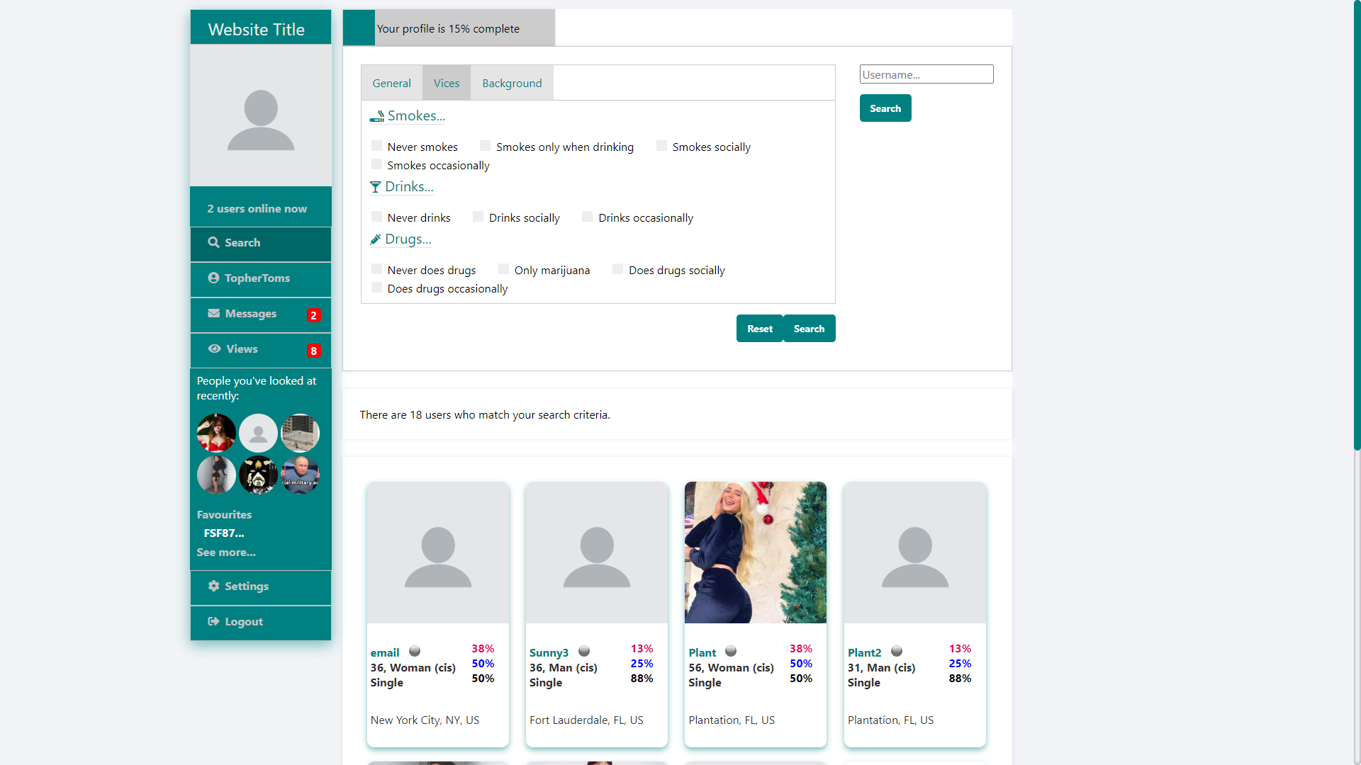
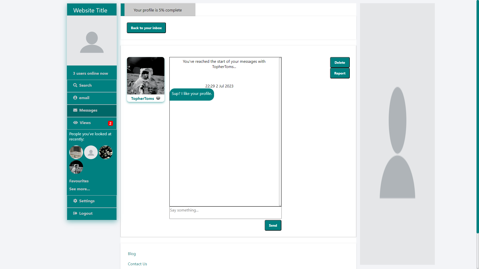
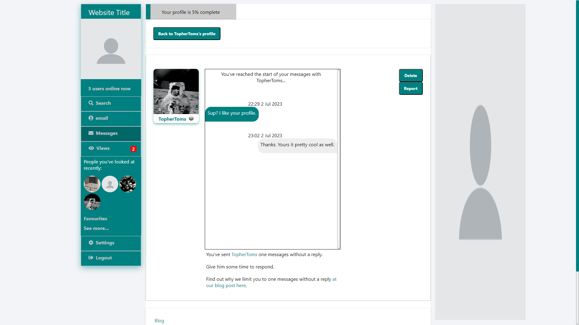
So, with the guidance of ChatGPT, I upgraded the messaging system to use JavaScript on the frontend to send messages to a WebSocket server which would update the database in the same way we did before, but also have the WebSocket server send the message to the JavaScript on the receiver’s end and update the messaging window with the new message without the need to refresh the page. We also use this code to lazy load messages: on page load, we only load the most recent 10 messages, and then load the previous 10 when you scroll up, ad infinitum until you reach the start of the conversation. This helps reduce the time it takes message pages to load. There’s also a handy little button that pops up and allows you to jump back to the first most recent message without having to scroll all the way back down. We also have a menu button on each message, which allows you to delete or report individual messages, and this is seamless as well (we handle the reporting/deleting on the server-side, and update the client-side to show the message as having been reported or deleted without the need to ever refresh the page).[i]

This was my breakthrough with JavaScript, and I decided to implement it elsewhere.

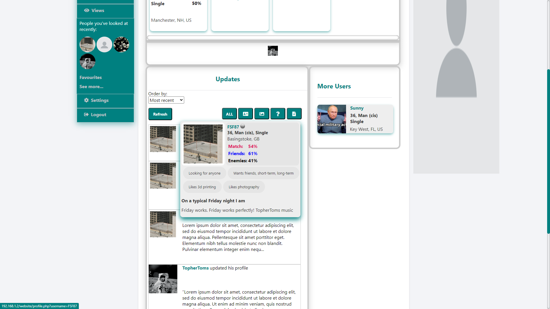
Over the last two months or so, I updated the login system, the notification system, profiles, some of the image handling, the updates[ii] and a few other things to use JavaScript and make using the site almost seamless with as little refreshing and page loading as possible. There are still instances where the page has to load (for example, switching between the about and the photos tabs on profiles (I tried to do something to handle this with JavaScript, but it would have required too much work with very little payoff, especially when there were more urgent needs)), but, most importantly, when receiving notifications, messages, and updates, there’s no refresh required.

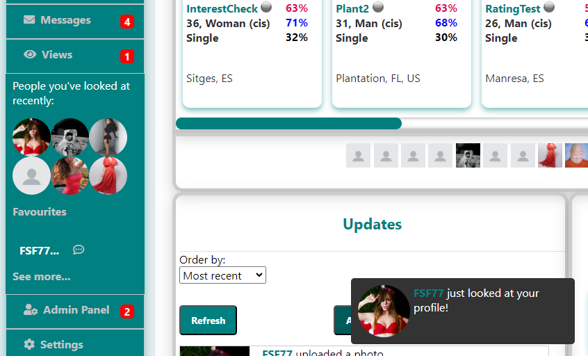
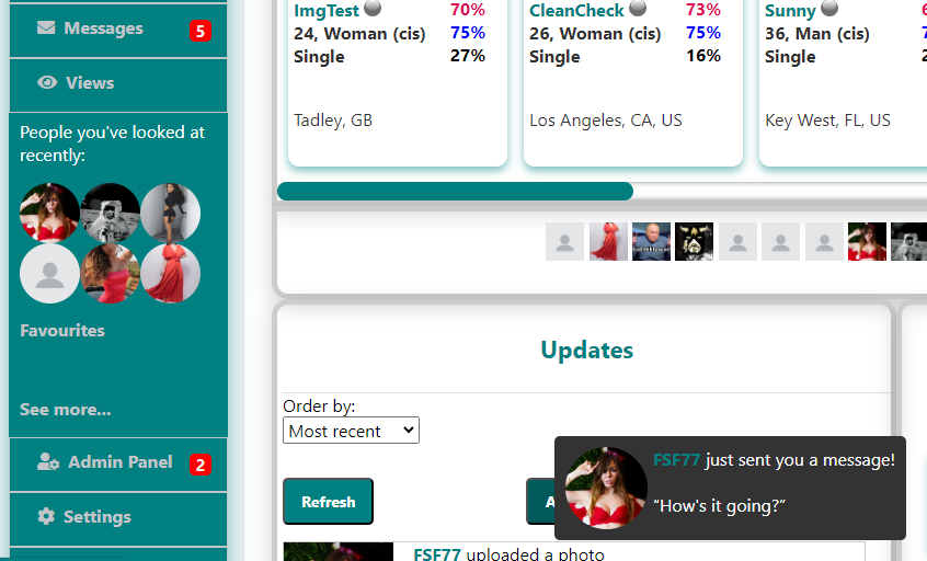
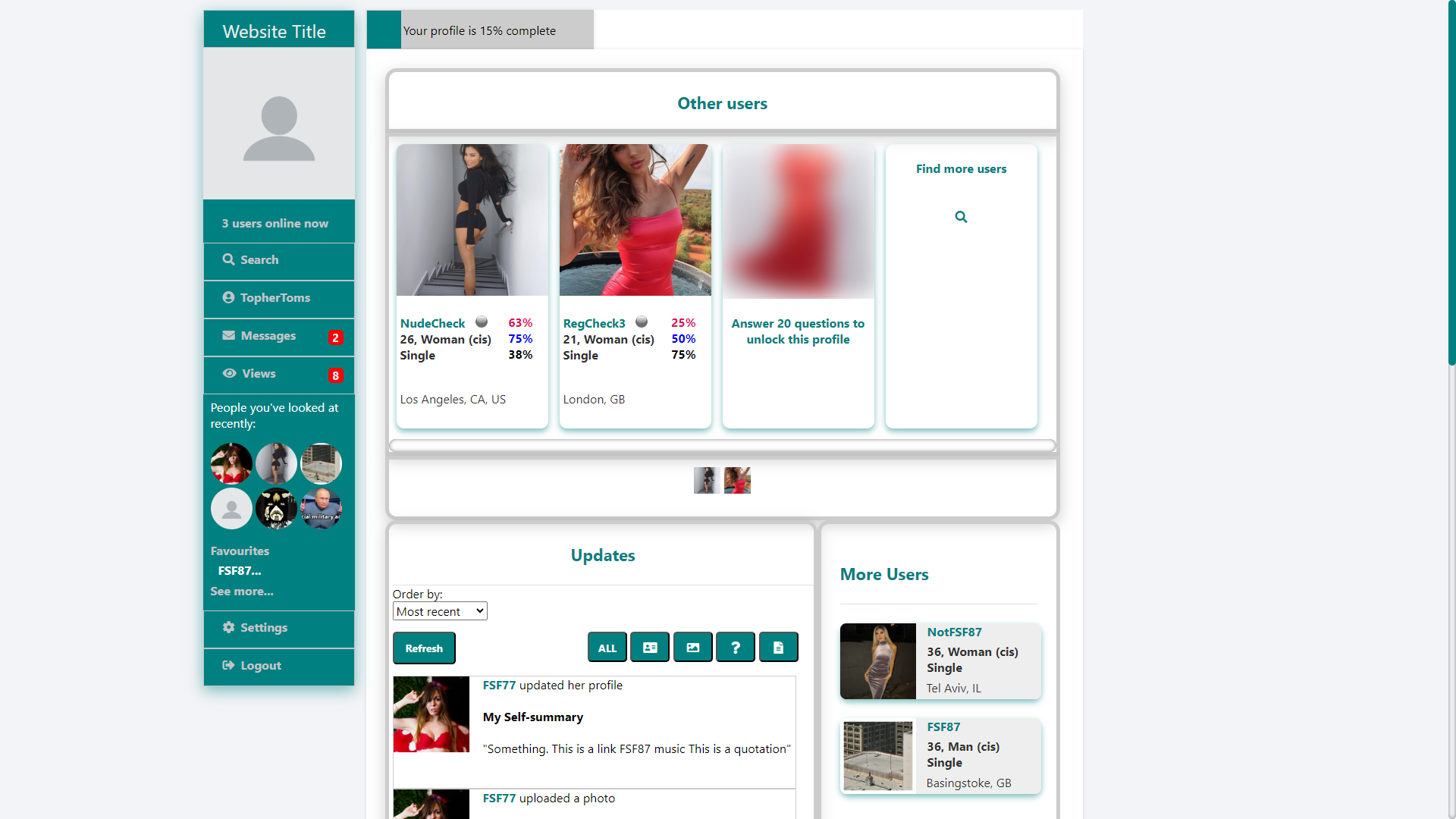
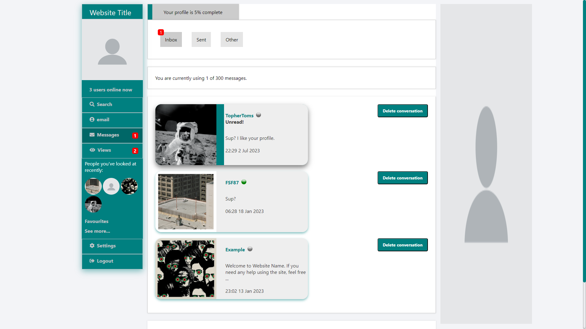
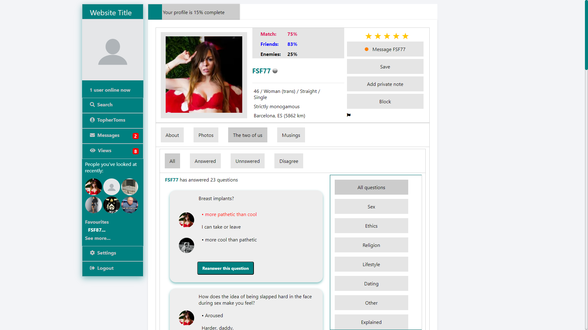
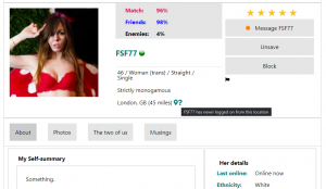
Notifications is a big part of this. Before, notifications were only displayed as number on the relevant button, and they were only updated when the user refreshed the page. Now, with our new notification system, we not only update notifications when they happen without the user having to reload the page, but, we can also put pop-up notifications on the screen that hang around for 10 seconds, so there’s less chance of the user missing them. At the moment, there are four types of notifications that pop up: when a bookmarked user logs on (which will also add the user to the favourites section on your sidebar); when a bookmarked user logs off (which will also remove the user from the favourites section on your sidebar); when someone looks at your profile; and, most importantly, when you receive a message (which doesn’t pop up when you’re actually viewing the message in question). There is still some refining to do with styles and what data we display (I’m thinking about adding profile pictures to logging on/off users like we do with message and profile view notifications, and supressing the pop up when the received message is going to your ‘other’ box), but it’s a start. I’m also considering moving the messenger system (including message folders) to a pop-up so you can access your messages wherever you are on the site without the need to navigate to another page.

Favourite user login notification

Favourite user log out notification

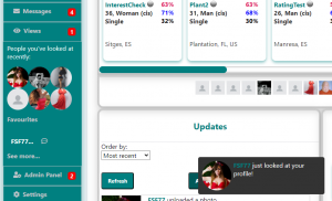
Profile view notifications

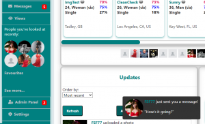
Message notification

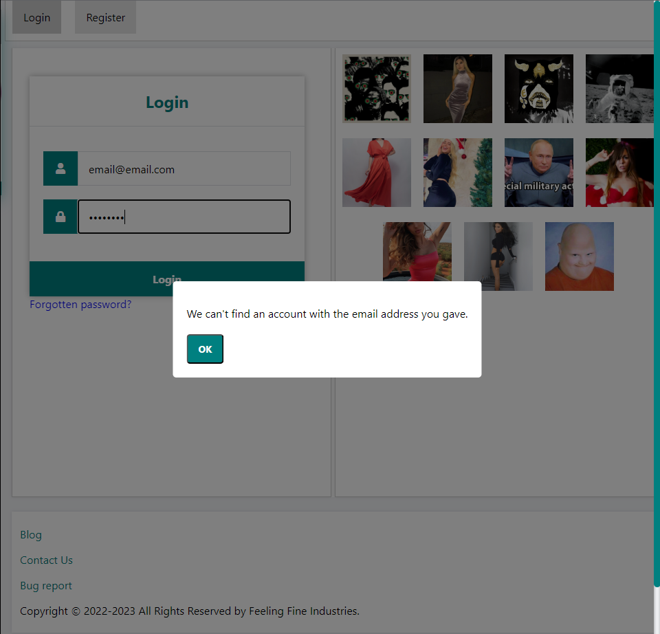
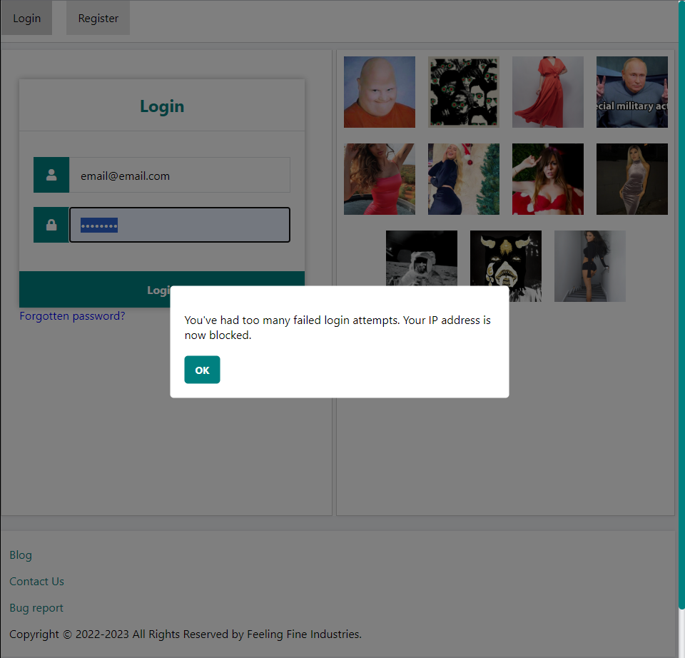
We also do something similar to the pop-up notifications with login confirmation. Failed logins will display a relevant message (wrong password, unknown email address, unknown username, etc) in a pop-up. We’ve also revamped how we handle lockouts after a certain number of failed login attempts. Before, we just blocked your IP address and displayed a plain text message without no real way to get unblocked (I’d planned to make an unblock request, but never got around to it). Now, on the fifth consecutive failed login attempt, you’re locked out for an hour. In this time, we hide the login form and display a countdown timer (I’m considering adding a note to the fourth failed login message that warns you that you only have one attempt left, and that you probably should use the forgotten password form).

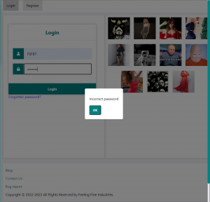
Incorrect password message

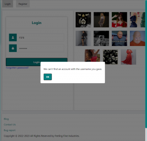
Unknown user message

Unknown email notification

Too many failed login message
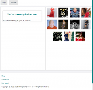
Lockout screen

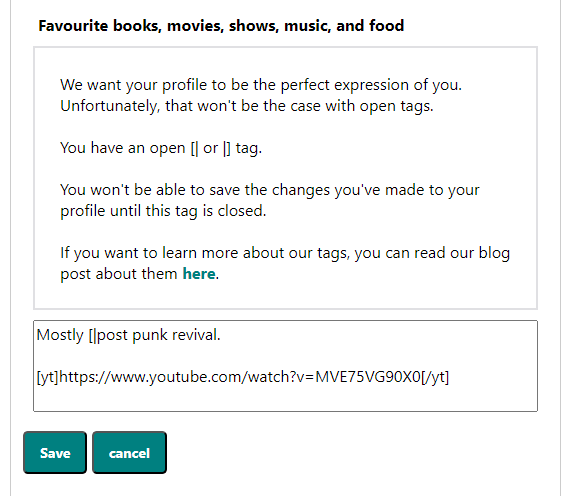
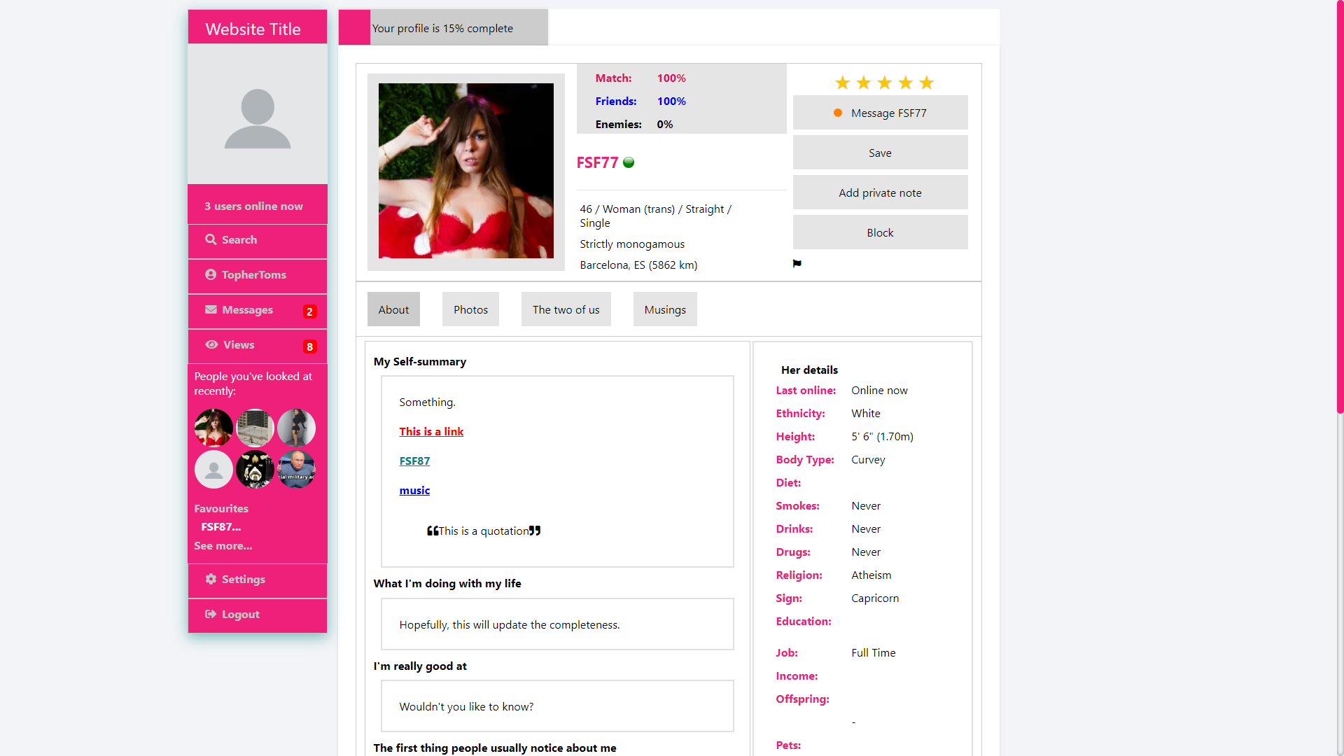
Profile updates now happen seamlessly. When you write something new on your profile, the new content will be displayed (with formatting if you use our markdown language) without refreshing the page, so you can easily move onto the next section without having to scroll all the way down from the top of the page. We also display an error message if you have an unclosed markdown tag. Unfortunately, we no longer offer a preview to help you find unclosed tags, but I think we should be able to add this back (now that I’ve learned more JavaScript).

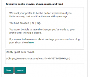
Unclosed markdown tag message

Photos are also almost seamless. Updating captions and deleting images are seamless. Reordering images still requires a page reload (which is only there to update the main profile picture on the top of the page), but we can easily change this to be seamless (I’m sure I can also update the main profile pictures[iii] with JavaScript if need be). I need to completely rewrite our upload form to make that seamless and not require a redirect to another page (I’m thinking a pop-up window with the form on the main gallery page).

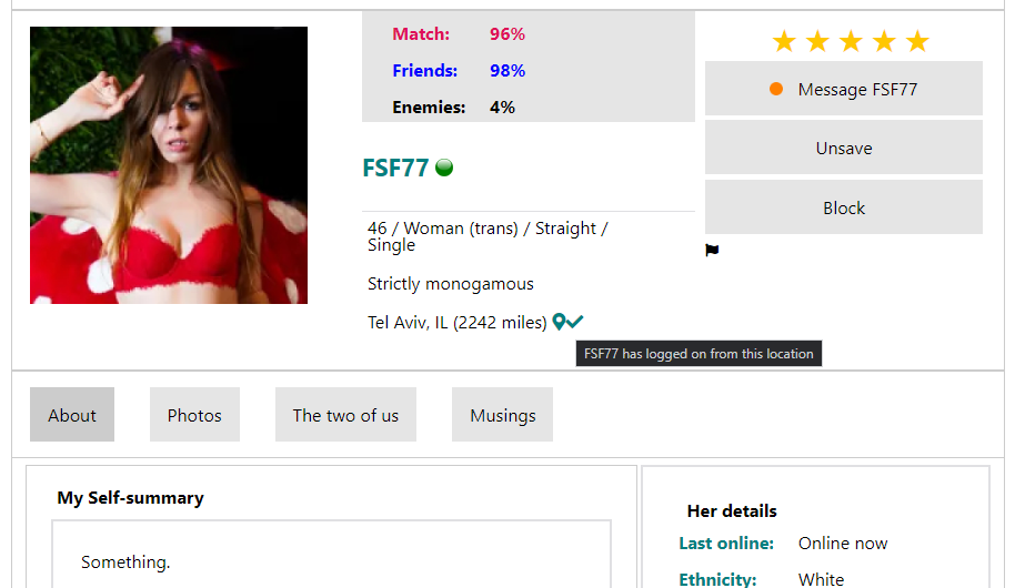
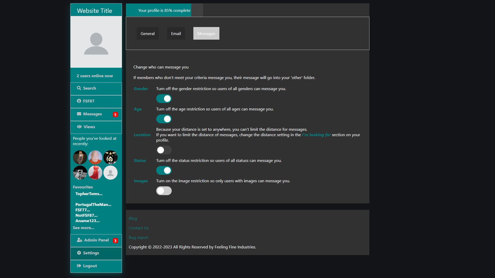
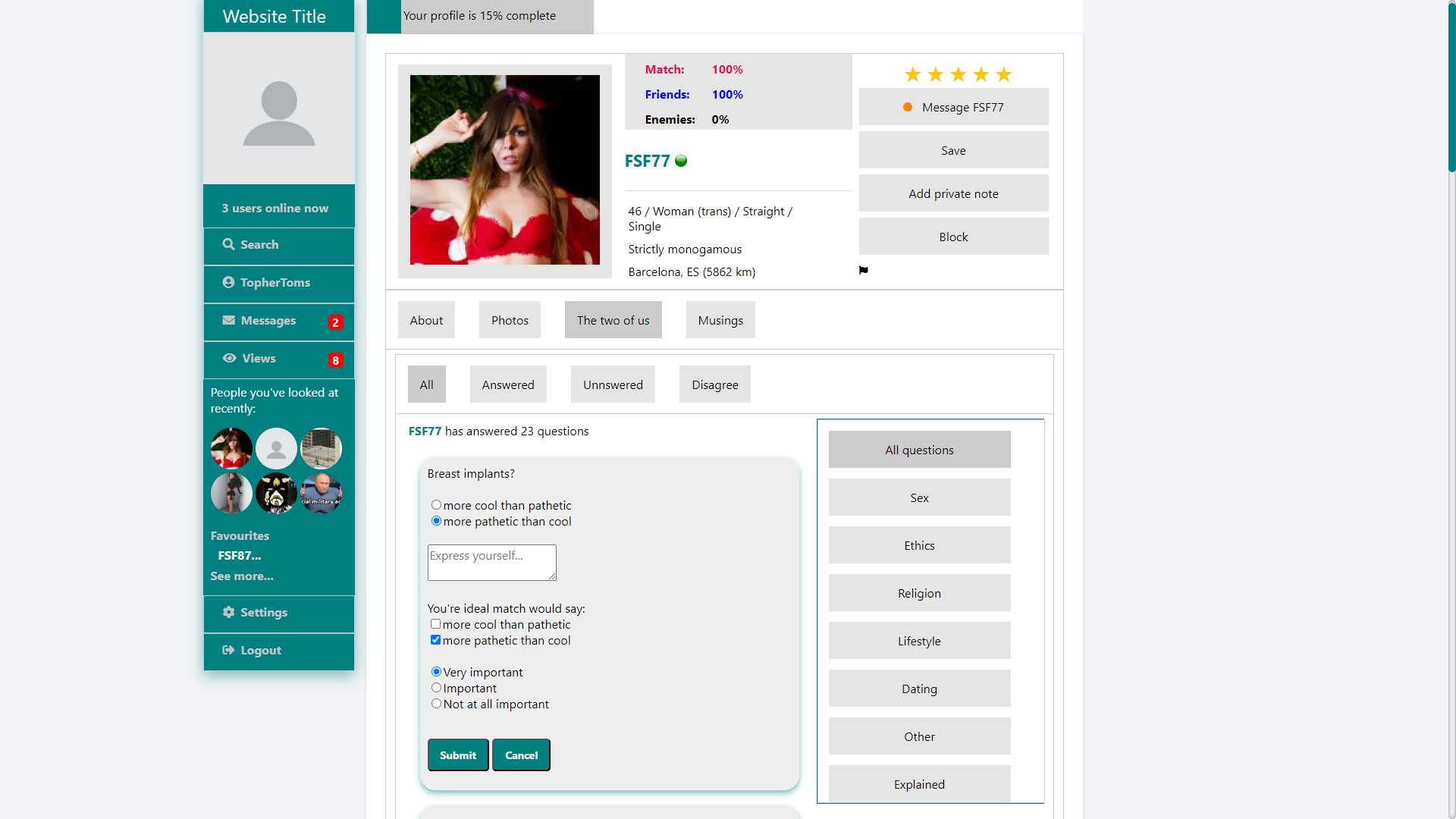
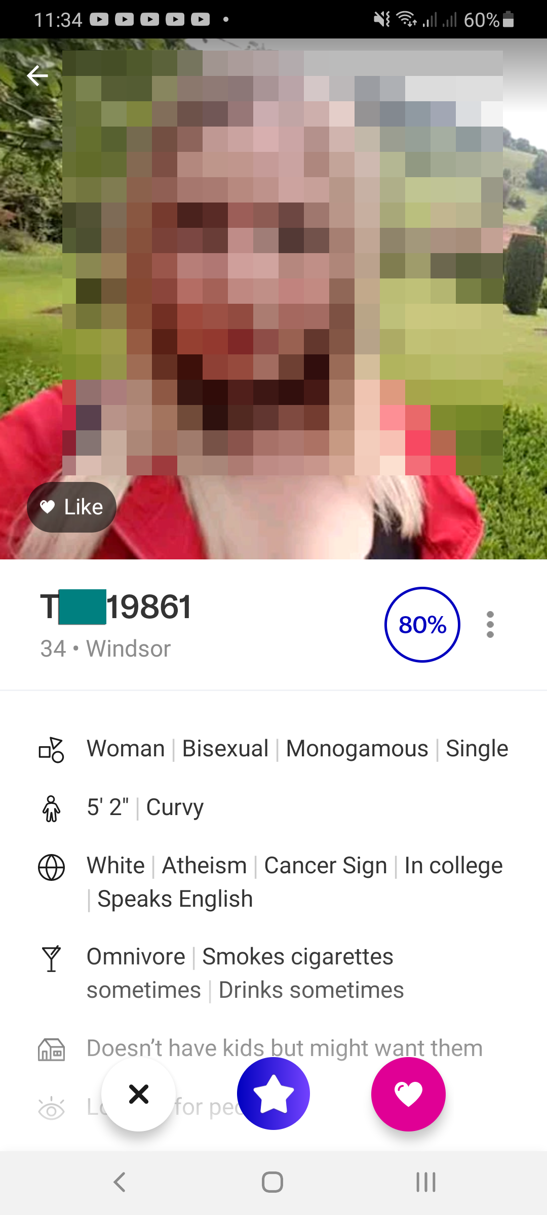
We now get your location from your IP address. Okay, we’ve always done this for security reasons (so you can see unauthorized logins). However, we now use this to suggest what location to put on your profile. On profile setup, you’ll see the location box automatically populated with what we believe is your location (based on your IP address). You’re welcome to change it if our guess is wrong, and, to make it easier for you (or harder if you’re planning on spoofing your location), suggestions will be ordered by distance from where your IP address tells us you are. The same is true of all other instances of the location search (on your profile, the search page, etc). We also have some code to crack down on location spoofing. Basically, when you log in, we cross-reference your IP location with our locations database and then store all the locations within 10 miles in our record of the login. We go with 10 miles because, we know geolocating IP addresses isn’t accurate, which will throw up false negatives, and hopefully to account for large cities (for example, if you live in the Roehampton neighbourhood of London, it won’t get mad at you for putting “London” as your location instead of “Roehampton” (I think in all my time using OkCupid from London, I only twice saw users put in their neighbourhood instead of just “London” (I actually dated one of them for a while)). Then, when someone looks at your profile, we look to see if your listed location appears in the list of all the locations you’ve logged in from (and all locations within 10 miles) and display a note saying if you’ve logged in from the shown location or not. It’s not 100% accurate, it cannot take VPNs into account (yet), and it doesn’t take tourists into account (e.g. someone in Brazil could spoof their location as being in London if they’d been on vacation in London) (although, putting a date limit on this could help reduce the chances of this), so I’m debating if we should make it available to everyone or just Super Members. But location spoofing is a serious problem with online dating, so having a way to weed out location spoofers, regardless of how accurate it is, it should be a useful feature.

Accurate location

Inaccurate location

I’ve also been working on session retention. Basically, if you closed the browser tab, it would end the session. This is because we were relying on basic PHPSESSID, which gets removed on close of the last instance (or when Chrome for Android is inactive for more than 5 minutes). I found a workaround for this with custom cookies, but it also screwed up the remote logout. When you force an unauthorized session to log out, it didn’t log them out because our custom cookie was just logging them back in again, so, I had to find a workaround for that as well. It seems to work, but still needs more testing. I also use a custom cookie to make logging in from the same device you’ve used before but with a different IP address less annoying. Before, if we spotted a login from a new IP address, even if it was the same device (say, logging in from your phone while travelling), it would block your login and send you an email with a confirmation code that you’d have to enter before regaining access to your account. This, obviously, would be annoying. Now, it should only require the login confirmation if you log in from a different device. Obviously, this is all security critical, so I can’t go into too much detail on how it works.

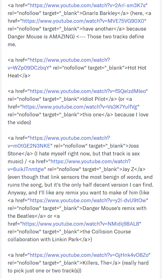
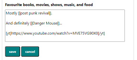
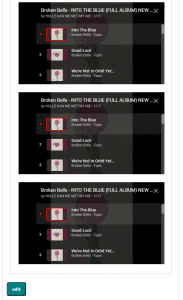
Finally, a quick update I did earlier today (well, yesterday now) that I’d been thinking about for a while. On my OkCupid profile, I had links to some of my favourite songs on YouTube (more specifically, I had an A to Z list of my favourite artists (in c.2014) with links to some of my favourite tracks from each of them). In fact, they’re still there (see below). The only problem is that, in around 2017, Match Group changed how profile sections are populated with the user generated content (i.e. what you write on your profile). As a result, it just shows the HTML as plain text now (although, it does convert the URL to a hyperlink). I loved having this on my profile because it helped me stand out. The favourites section on anyone’s profile was always the most boring part, and I would often skip reading it, but it didn’t have to be boring. So, linking to music that helped define me made my favourites section less boring than most, and I got some compliments about it. So, recently, I’d been thinking about making it more widely available, and having it so people didn’t have to open a new browser tab to be able to listen to the music. The solution was to add a YouTube tag to our markdown language that embeds YouTube videos on your profile. You can use more or less any style of YouTube URL (I think I’ve tested all of them, but who knows) or even just the video ID, and it will embed the video on your profile for anyone to see. Obviously, the original purpose was to give people an idea of the kind of music you’re into and give your profile a soundtrack; however, it can be used for more than that. For example, you could record a video of yourself doing your favourite hobby, maybe have a video intro where you talk about yourself and what you’re looking for, or maybe recite your favourite poem. The possibilities are endless. Just upload your video to YouTube, paste the URL somewhere on your profile (within the [yt]/[/yt] tags), and let people see/hear you. Unfortunately, it doesn’t work with playlists yet, but that shouldn’t be too hard to implement.

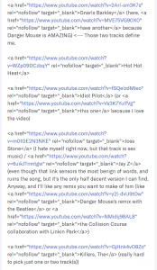
Snippet from my OkCupid profile

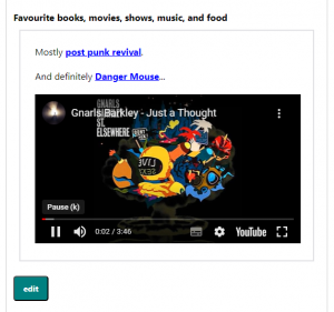
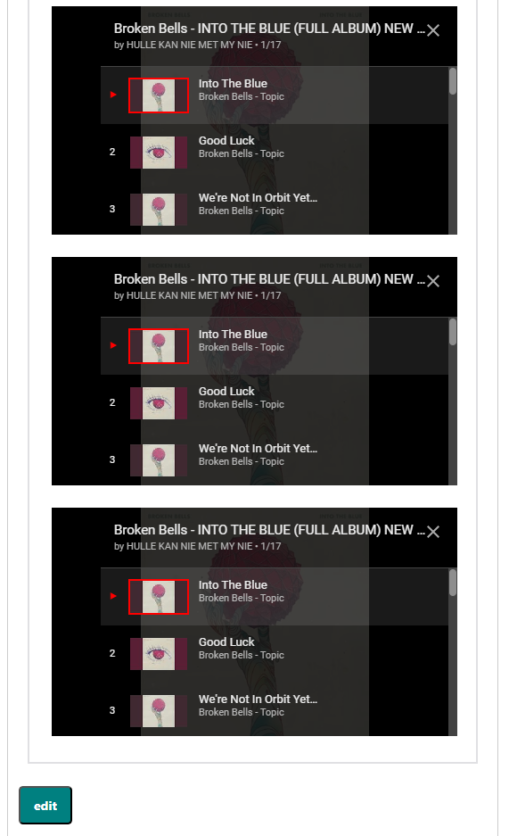
Embedded YouTube video

The markdown tag for the embedded YouTube video

With all that done, there’s still a LOT more to do.

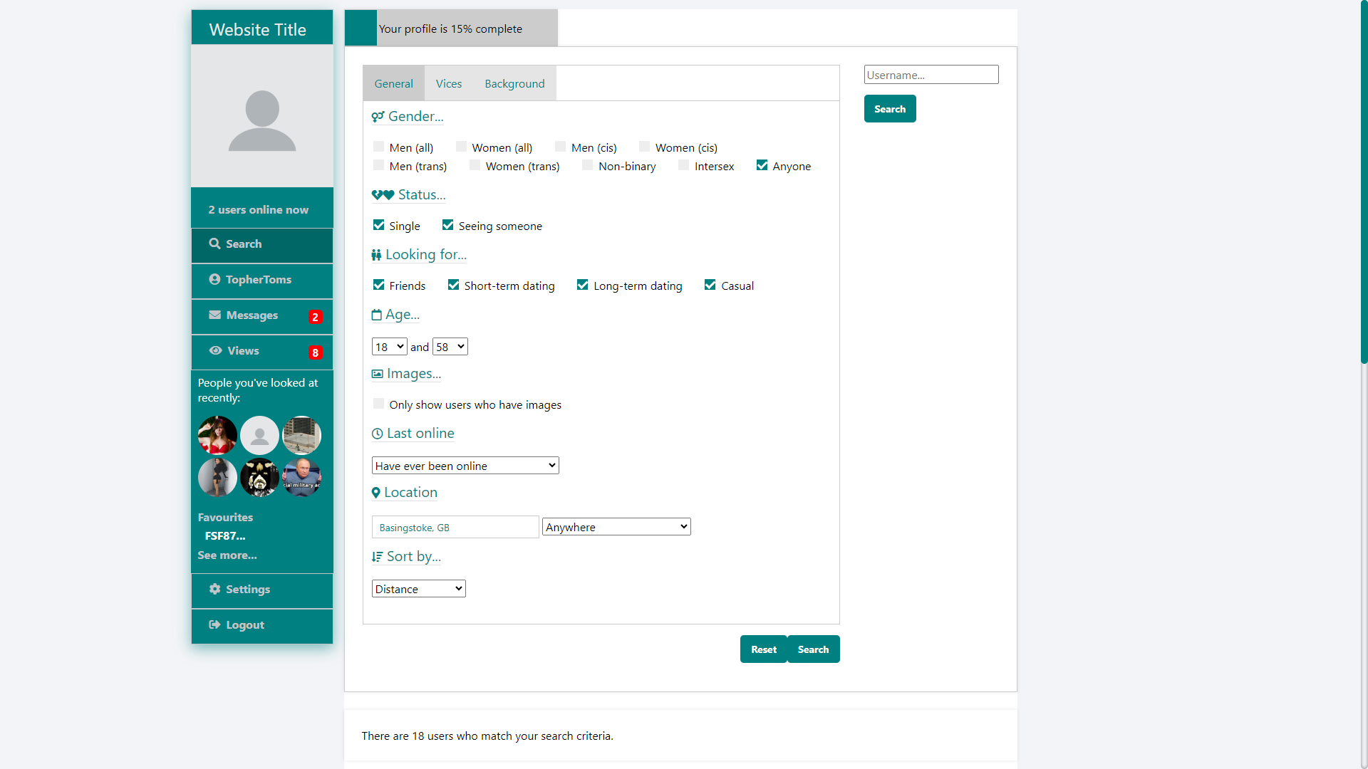
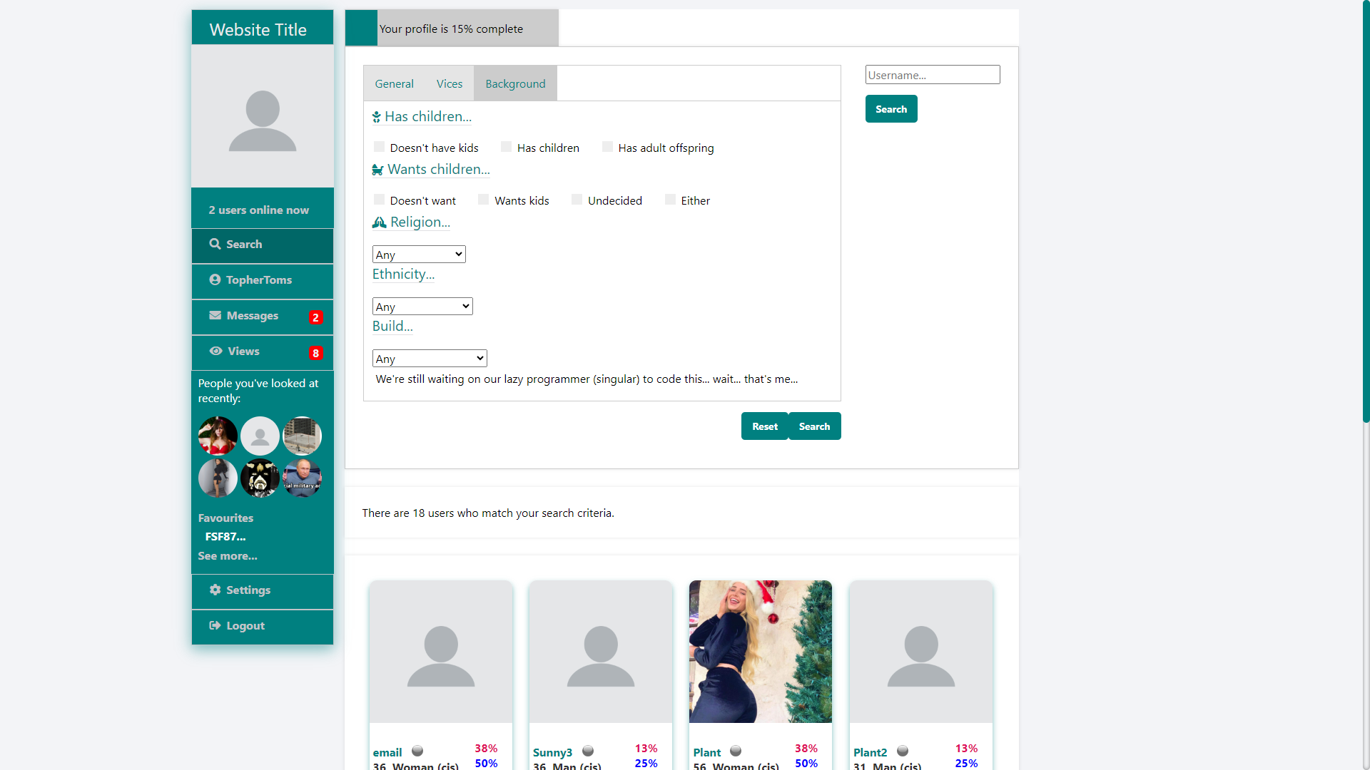
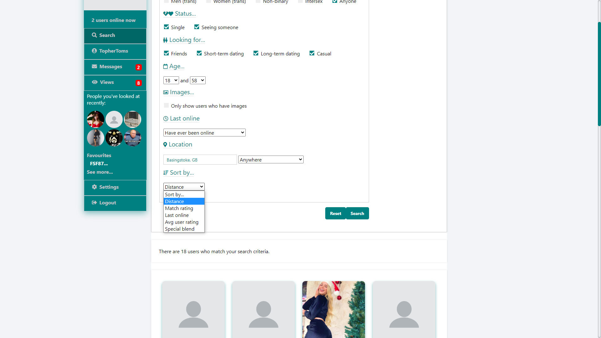
I want to make the search page completely JavaScript-based. At the moment, the only JavaScript we use is for updating the results with an infinite scroll (similar to what we did with updates (see endnotes)), the location search, and the interest search bar. Form population and submission are handled completely by PHP. This means having to reload the page on form submission, even when changing the sort order. What I want to do is handle form submission with JavaScript/AJAX, which should give you a seamless experience with less waiting. We could also have the form submit on change, meaning you get results as soon as you check a box or change anything without having to click ‘search’. And, most importantly for me, it should simplify the code, removing about 1,000 lines of redundant code (the search function in its entirety is about 3,000 lines of code).

The same needs to be done with questions. I’ve never been happy with our questions section, so it will be a complete overhaul from the ground up. I also want to add an ‘answer in private’ option so people won’t be able to see your answers to questions you don’t want others to see your answer to. Of course, questions answered in private will still count towards your match/friend/enemy ratings.

I want to add tests/quizzes. We have some code for it, but, like everything else I wrote about 10 months ago, it’s very clunky. I wasn’t happy with it, so I ended up removing it completely. So, a JavaScript update is much needed.

Mobile styles need to be overhauled. I started it, made a new navigation bar, but never got around to making EVERYTHING stylized for mobile (mainly because it would require rewriting EVERYTHING… or, nearly everything).

Mobile layout


And, on the subject of the navigation bar: I want to redesign the desktop navigation bar (again) to make it look more modern and make it easier to use. However, that won’t happen until I’m ready to completely overhaul the design on the website.

I’m also honing in on a name, but suggestions are always welcome.

I’ve seen a bit online about profile linking for people in non-monogamous relationships (mainly because Match Group are in the process of removing it from OkCupid). I’m considering adding something like this, but, until I do, there’s always just tagging other users on your profile. And, while we’re on the subject of tagging, I think I might make it consensual. Like, if you tag a user, they would have to accept it before the tag would appear on your profile. I need to figure out how to implement that.

And, while we’re on the topic of things OkCupid used to have: I really enjoyed the ability to suggest edits to other people’s profiles. This was back in 2010/2011, and was one of the first things to be scrapped in the Match Group takeover (along with quizzes, user blogs, and The Psychologist Game). My partner at the time and I would have full on conversations on each other’s profiles that everyone could see. She would edit my profile, I would respond to what she said, then she’d edit my profile again responding to my response. I need to come up with a way to recreate that.

A few months ago, I overhauled how we handle genders; a side effect of this is that we can easily add new genders (as soon as I write the code for adding them). Related to this, I do want to overhaul how to handle pronouns. At the moment, the pronouns we use are based on gender. So, a woman (either cis and trans) is referred to as ‘she’/’her’, an intersex or non-binary person is referred to ‘them’/’they’, etc. However, I want to have user-selected/user-added pronouns, so you can decide which pronouns are used when the site refers to you.

I’m considering using locations based on IP address with the messaging filters instead of user input locations, so, if you do have the distance filter set, messages from location spoofers who claim to be within your search radius but are actually outside of it will be put in your ‘other’ message box instead of your inbox.

Finally, I’m planning initial deployment within the next couple of months (which I’ve been saying for the last couple of months). I’ve got a server I can use to deploy a beta version of the site, I just need to set it up. Membership levels (either Free Member or Super Member) for beta testers will be selected at random (literally the roll of the dice), and then all beta testers will be given free lifetime Super Member status at the end of the beta programme, regardless of which member level you’re assigned.

Addendum:

Here’s how far the website has come in the last 50 weeks.

How it started

How it’s going

[i] On the subject of the messaging system, there are is still two one slight bugs. Firstly, long story short: we had to switch to a fixed height for the main element on the message page, as a result, our expanding textarea (where you type out the message you’re going to send) bumps into this when you’re writing a long message, which makes the page jump up and down. There should be an easy fix… just limit the height of the textarea so it doesn’t bump into the limit of the main element (similar to how textareas work on other app/websites, like the message textarea on Facebook Messenger and comment textareas on Facebook). Secondly, at the moment, if you receive a message when scrolled up, it automatically jumps back down to the most recent message; I’d like to have a button pop up that notifies you of the new message, and only scroll down when you click it (I thought I had implemented it, but it clearly doesn’t work).

[ii] The Updates section on the Home page was already using JavaScript/AJAX to load additional updates when the user scrolls down, but it still required reloading to switch between update types, sort order, refresh, etc, and it also meant duplicate PHP code (once on the home page, and once on the backend), but now the user interaction is completely handled by JavaScript, so, when you change the type of updates you’re looking at, the JavaScript clears the updates window and populates it with the new type without refreshing, and we only need the PHP code on the backend.

[iii] We now have three main profile pictures that pop out from under the main one when the user hovers over the thumbnail.

[UPDATE]

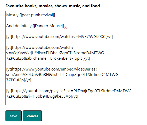
I’ve got embedded YouTube playlists working. I’ve tested it with a few kinds of playlist URL and they all work. However, I don’t know if I’ve got them all, so I’ll keep an eye on it. The markdown tags for playlists are the same as with regular YouTube videos, so you can just post the link and the backend will do all the hard work for you.

Playlists (three different ones)

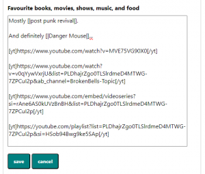
The markdown for playlists.

Well, I’ve finally done it

Well, I’ve finally done it.

Kind of.

I’ve been doing it for the last nine and a half months.

What have I been doing?

Learning web development so I can recreate what we lost when Match Group took over OkCupid.

It’s still a little way off from being ready for launch, but, because of how much support I see for a project like this, I figured it was time to unveil this project.

So, here it is, my untitled dating site project.

Umm… yeah, I don’t even have a name for it. I don’t do marketing (as will become clear as you read this blog post).

So, what does it have?

For starters, let’s look at something it doesn’t have. It doesn’t have swiping or matching. It’s designed not to be a deck of cards like nearly every other dating platform is.

Users are free to look at who they want, without having to wait for an algorithm to show them.

So here it is:

On the home page, you’re shown a selection of users who match your search criteria in the Other Users carousel along the top. And, yes, these users will match your search criteria. The site won’t ever show you users who are, for example, outside of your search radius (unless you specifically search for them).

Further down, on the right, we have even more users who match your search criteria.

In the main part of the screen, you will see updates from users who match your search criteria. These updates can be profile updates, photo uploads, questions answered, and blogs written. You can sort these updates by most recent, or by users who are closest to your location.

The Updates, I feel, helps with user engagement. Unlike apps that use deck of cards, you can see that users are active, that users are updating their profiles, that users are uploading new photos, that users are answering questions, and you can be confident that the users you see in Updates have been recently active, and that they’re not long abandoned profiles.

As well as this, it can introduce you to new people. If you see a dude who answered a question the way you like, you might want to check him out. And if you want some attention, just update your profile, and you will be on the home screen of users who are looking for people just like you.

In the Updates section, if you hover over the user’s profile pic, you can see more details about that user, including their age, gender, status, and location, your Match, Friends, and Enemies ratings, what they’re looking for, some of their interests, and a little bit from a random section of their profile.

Where to start with the user profiles?

Firstly, you might notice that the theme has changed. This is irrelevant to profiles themselves, I just changed the theme between taking screencaps. Basically, if you don’t like teal (what is wrong with you?), you can have pink instead.

Back to the profile.

Along the top, there’s some of the information we saw earlier in the popup, and a bit more. Here, we also see orientation and monogamy preferences.

Next to all that, we see that you can rate users out of five stars. This is the closest thing the site has to a matching system. If you and a user both rate each other 4 or more stars, the site will let you both know. Even when this happens, only you can actually see what you rated a user. However, the site does average each user’s star rating, and premium members can sort search results by this metric.

Below that, we have the message button, which uses a traffic light system to tell you how likely a user is to respond to your message, with red being very selectively, amber being selective, and green being often.

Below that, you can add a user to your favourites, so you’ll know when your favourite users log on.

Below that, you can add private notes about the user that only you can see. This, I feel, can help you remember at a glance what you like or dislike about the user when you revisit their profile.

Below that, we have the block and report buttons (self-explanatory).

Now, onto the meat of the profile.

I wanted profiles that aren’t limiting like so many other dating platforms. The user can put as much or as little on their profile as they want. There are the nine prompts that used to be standard on OKC because they, I think, were perfect prompts, and users can fill in whichever of them they want. The only one that is mandatory is the ‘My Self-summary’ section.

Within each section of a user’s profile, they can use a markdown language that I created so they can format their profile with underlined, italic, bold, and struck through text (not shown), add external links, tag other users, add interests, and add quotes (shown).

Along the side, there are details about the user, like when they were last online (yes, you can see when users were last online), their height, ethnicity, and all that stuff. These have two purposes. Firstly, so you can learn more about the user you’re looking at. Secondly, these are all search criteria (yes, the site has a search feature)… or, at least, most of them are search criteria… I haven’t coded for all of them yet, but they will become search criteria when I can be bothered to add them to the search page.

Talking of searches.

This should be self-explanatory. You select your criteria, select the metric by which you want results to be ordered, and click search. You can also search by username (top right).

I should point out that some of the search criteria (ethnicity and build) and order by options (avg user ratings (remember the five stars from earlier?)) will only be available for premium members.

I will also add an interest search at some point, so you’ll be able to type in interests and search for people who mention it on their profile. The backend is complete, so you can click an interest on someone’s profile, and it will do the search, I just need to add the text box to the search page (it’s harder than it sounds (I’ve been through three iterations, and I’ve not been happy with any of them)).

Once you’ve found someone you’re interested in, what do you do? You message them, of course.

The site limits how many times you can message a user before receiving a reply. Initially, you can only send one message, but, as you complete your profile (yeah, that progress bar at the top of every page), you’re allowed to send two, and then three messages. Premium members can send four sequential messages. If either the sender or the recipient deletes a message, the count does not get renewed. It only gets renewed when the recipient replies. This is to stop messages from nuisance users who don’t know when to take the hint and will message you over and over and over again, even if you don’t reply.

Oh, and premium members get read receipts (not pictured).

There are three message folders: inbox, sent, and other. Mostly self-explanatory. Inbox is for messages you received, sent it for messages you’ve sent, and other is for messages you receive from people who you don’t want to receive messages from (see below). If you reply to someone in your other folder, all their messages get moved to your inbox.

Inboxes are limited to 300 messages for free members and 3,000 for premium members. Premium members can also send messages to people who have full inboxes.

A little more on the other message box.

Ignoring the switch to dark mode (yes, the site has a dark mode), the site has message filters.

Say you’re flexible with age, just turn off the age filter and, when someone who’s older or younger than you’re looking for messages you, their message will appear in your inbox.

If you only want to receive messages from people who have profile pictures, just turn on that filter and, when someone without a photo messages you, their message will go to your other box.

So, how do you decide who to message? Match, Friends, and Enemies ratings, of course.

The Match, Friends, and Enemies ratings are based on the questions you both answer. It’s not just a random number like OKC seems to be now.

This is just a glimpse at what’s already done. There are still a lot of things I haven’t mentioned (blogs/Musings, photos, all settings, etc). And there’s still a lot that needs to be done (quizzes, personalities, finishing the search criteria, a mobile version, etc), but I figured I’d let the world known now.

If you have any suggestions (like a name for the platform) or questions, let me know in the comments below.

Your profile is no longer active

When OKCupid tell you your profile is no longer active, it is a demonstrable lie, and it’s very telling.

OKCupid recently sent me an email saying that they had stopped showing my profile to other users because I hadn’t used the app/site for about a month.

This email was delayed by at least 9 hours because I received the notification from the app on my phone the previous night.

However, later that day (or the next day if we’re going by the app), without logging back onto the app/site and reactivating my account, I received an email saying that someone had liked me back.

The user appears to have also sent me an intro four minutes later. Although, I haven’t logged on to see if the intro sender was also the liker, so I can’t say for sure if they’re the same person.

There are really only two possible causes for this behaviour:

  1. OkCupid didn’t actually hide my profile (i.e. they lied when they said they did). Or,
  2. OkCupid withheld a like that I had received a while ago and decided not to show me it until I’d given up on them as a way to try to lure me back (i.e. they’re deceptive).

Neither option is good for OkCupid.

I would suggest that the first option is more true. After all, I’ve already covered how Match Group doesn’t actually hide inactive profiles on OkCupid. However, I would go further. I would suggest that OkCupid took active measures not to show my profile to people I had liked (I’ve already covered how Match Group withholds likes on OkCupid), and they only reversed this and showed my profile to someone I’d liked when I hadn’t used the app in a month as a way to lure me back on. I mean, the timing is very suspect. They had a whole month (at the very least) to show my profile to this user, but they decided to leave it until after they had allegedly stopped showing my profile to people.

This brings me back to the main thesis of this site:

Match Group’s goal is not to find you a match. It’s to keep you single and on their shitty apps for as long as possible so they can make more money. They profit from your loneliness. And it’s easier for them now more than ever since they’ve taken full control of who you can see and who can see you.

I tried Hinge

Holy shit it is bad.

I thought Tinder was the worst of the worst, but Hinge is on another level.

Match Group advertises Hinge as being designed to spark intelligent conversation. Good luck with that. You can have a maximum of three answers on your profile, each with a character limit (150 characters), so it’s unlikely you’ll be able to say anything of substance. For context, that last sentence is 164 characters (including spaces and punctuation)… 14 character more than you could fit in an answer on Hinge. The character limit is transferred across to messages as well, so expect conversation to be stymied somewhat.

It is also advertised as not having swipes. I mean, technically, you don’t physically swipe the screen to like or dislike someone, but the basic premise is the same: vapid, superficial, instant decision on whether to like or dislike a random person… the same as Tinder and OkCupid. This basic format is what I term “swipe culture”, whether you physically swipe of not.

Where it departs from Tinder (and OkCupid, for that matter) is in messaging. You can send messages to other users without matching first. But there is a catch. You can only like/message someone if you complete your entire profile. This isn’t like how OkCupid used to limit how many people it showed you on the home screen based on how much of your profile you’d filled out. That was incremental. This is all or nothing. This means answering three questions and uploading six pictures. Ah, there’s the superficiality of the app again. Style (pictures) seems to be more important than substance (words), which is why it seems mainly to attract vapid, fake, wannabe Instagram models. There’s also the question as to whether the recipient receives messages before liking the sender (much like OkCupid’s short-lived intros that were scrapped earlier in the year). I cannot answer this question definitively (yet). However, considering it has “roses” (akin to OkCupid’s “superlike”), I’m guessing not.

It also feels rather cookie cutter. As mentioned earlier, you’re giving stymied answers to three questions from a list of around 75 pre-set questions. Again, because of the character limit, it can be hard to get across anything of substance. I mean, I struggle with Twitter’s 280 character limit, so cutting that in almost half is a nightmare for me. You can kind of caption your six pictures… kind of. You can use one of around 70 pre-set captions. Because of these limitations, it can be hard to show any personality you may have (which probably explains why no one I saw on there seemed to have a personality).

Ultimately, I would not recommend the app.

Withholding likes (more on OkCupid’s broken algorithms)

One of the biggest problems I see with OkCupid is that you are no longer in control of who you see. Match Group completely removed the search function sometime in 2020, so you can no longer choose who you want to look at. Instead, the site/app just shows you seemingly random people, one at a time and you have to make an instant decision then and there as to whether you like them or not (much like Tinder before it, and pretty much every other dating site/app since). The problem with this is that, when you receive a like, you have to wait for the algorithm to show you the user who liked you in Discover before you can interact with them. This leaves the door open to manipulation by Match Group. Ultimately, the likeliness of you finding a match is in the hands of Match Group, and it is determined by how much money you’re willing to give them. Let me explain.

Imagine, if you will, a truly altruistic company that wants you to find a match. You’d think that that company would be eager to show you who liked you, you know, it would be all “hey, this person likes you. I think there might be something in it. Do you want to check him/her out to see if the feeling is mutual?” You know, that’s something you’d expect from a site specifically designed to find you a match.

Now think of the opposite of that. Think of a company that doesn’t care about finding you a partner, that only cares about its profits, and will try to get every penny out of you that it can. The last thing that company wants is for you to find a match and stop using its service. You finding a match and deleting your account is bad for its bottom line. This company is likely to hide likes behind a paywall, and then just never show you people who liked you in Discover.

I ask you: which of these companies does Match Group most resemble? Clearly the second one, right?

Now, granted, Match Group does show you some likes in Discover. If they didn’t, no one would ever get matches, and everyone would leave the platform. That, of course, would be bad for Match Group’s bottom line. Thus, Match Group has to find a balance between giving you too much, and giving you not enough.

My estimation is that between only 25% and 33% of your likes show up in Discover. The remaining 67% to 75% will forever remain behind that paywall. However, I cannot say for sure until I do an experiment, gather data, and run the numbers on a profile that hasn’t been tainted by ordinary usage for the last 15 years. (More on this at a later date if I decide to conduct said experiment.)

There are a few questions you might be asking right about now. The most obvious one is: “how do you know Match Group hides likes?” I’ll cover this in a bit. You might also ask “how do you know you haven’t just swiped left on people who have liked you?” Curiosity always gets the better of me. I want to know how effective the algorithm is, so I nearly always swipe right, even on people I’m not interested in. Another question might be: “How do you know the likes you received aren’t from people further away than the distance you’ve set in your preferences?” Well, OkCupid really doesn’t pay attention to the preferences you set (just like Plenty of Fish, which I outlined in a post here). I often see people in Discover who live over twice the distance than I set in my preferences. I have also received some likes from people in other countries, namely, the United States and Norway (much further than the 50 miles from London, UK, that I’ve set in my preferences). I know of their existence because they showed up in my Discover and we matched (remember, I always swipe right). You might also ask: “how do you know they haven’t just disabled their account?” Well, if they had, my like counter would go down; instead, it remains the same and only changes when I receive a like.

If you have any questions that I haven’t covered here, leave them in the comments, and I’ll try to address them.

The most obvious argument for Match Group hiding likes on OkCupid is this: showing you all your likes in Discover negates the need for premium memberships. Match Group have stripped OkCupid of so many features that the only real benefit of premium accounts is seeing likes without having to wait for Match Group to show you them in Discover. If Match Group showed you all your likes in Discover, no one would ever pay for a premium membership. The practice of not showing you likes in Discover is designed to get you to upgrade to premium for between £14.83 and £29.66 a month (depending on which plan you go for).

Ultimately, it comes down to this: despite its name, Match Group is not in the business of finding you a match. Finding you a match goes against Match Group’s business model. When you find a match, Match Group loses a potential revenue stream. Instead, Match Group is in the business of selling you false hope. Match Group profits off your loneliness. As a result, the system that Match Group has implemented on OkCupid (and most of its platforms) is rigged against you.

More on Match Group’s broken algorithms (OkCupid)

I’ve covered before on this blog how Match Group does not use information you give it about your ideal match when providing you with suggestions on its Plenty of Fish platform. Today, Saturday 29th May 2021 (this will be important to know in a little bit), I am going to talk about the algorithm on Match Group’s OkCupid platform, and give an example of how broken it is.

Do you remember when OkCupid used to tell you when a user was last online? It was a brilliant feature because it meant you could avoid wasting time messaging someone who would likely not reply because they were no longer using the site. For example, if a user had not been online in over a month, it was likely that they’d given up using the site for whatever reason, and you were unlikely to get a response, so it wasn’t worth your time messaging them (once you got over the delusional “what if my message brings them back to the site” phase). You could also narrow down searches (when you could search) for only users who’d been online within a set period of time (a day, a week, a month, etc), so you could avoid even clicking on potentially dead profiles, saving you time on having to read that information on their profile.

This feature, however, was bad for Match Group. It allows users to hide dead profiles, which shrinks OkCupid’s apparent userbase. With fewer known active users, other users put less time and effort into the site, possibly giving up on the site entirely, which shrinks the active userbase more. Many of my OkCupid (and Plenty of Fish) hiatuses were caused by how stagnant the place was. I would keep seeing the same people every day, with no new users, and it just got boring.

Removing information about when a user was last online allows Match Group to pass off dead profiles as active ones, which artificially inflates the apparent userbase. Showing dead profiles means that OkCupid is unlikely to run out of people to suggest you to in Discover (since you have to rely on OkCupid showing you people, instead of being able to look for the kind of people you want to look for).

“But, Frank, do you have any evidence of Match Group showing dead profiles?” I imagine you asking. Firstly: my name’s not Frank, and it’s not what either of the Fs in my name stand for. Secondly: yes. Yes, I do. I have conclusive evidence that Match Group feeds you long dead profiles in your swiping sessions.

Thursday 21st December 2017. This is the date that OkCupid died. It’s the definitive line between the cool, old OkCupid that we used to love, and the boring, Tinder-clone OkCupid that we hate. This was the date when OkCupid phased out pseudonyms. It was a massive overhaul that pissed a lot of people off. Users crafted their pseudonyms around their personalities, they identified as their pseudonyms, it was a part of who they were. On top of this, users often felt safer without having their real name on their profile. It can, however, give us a baseline, a bare minimum estimate of when a user was last online. Let me explain.

After the switch to real names, a user could no longer use special characters or numbers in their username. When a user logged in for the first time after the switch over, they were greeted by a screen telling them to change their name. If they didn’t change their name to remove numbers or special characters, they couldn’t use the site (trust me, I had to use FSFEightySeven for a while before giving up and using my real name). Thus, if you see anyone on OkCupid today with numbers or special characters in their username, they have not logged on since at least that date.

I give you T***19861.

This is a profile that OkCupid served me earlier today (Saturday 29th May 2021). As you can see, T***19861 has numbers in her username. This means that T***19861 has not used OkCupid in at least three and a half years.

It makes you wonder: if OkCupid are serving you clearly dead profiles that have been dead for over three and a half years, how many other profiles that you see in a swiping session are dead as well?

The algorithms that Match Group uses just do not work (Plenty of Fish)

We’re going to look at three potential “deal breakers” on Match Group’s Plenty of Fish (PoF) app: distance, smoking, and kids. We chose these because they are all categories you can enter as options on your profile. We looked through 110 profiles that were given to us in the Recommended section of the app (at the very bottom of the home screen), without discriminating based on looks (i.e. we looked at people we wouldn’t regularly look at). Here’s the breakdown of what we found:

Firstly, distance. PoF gives you two options for who can contact you based on distance: within 75 miles or anywhere. One assumes that if you select 75 miles, you’re not interested in people beyond 75 miles, so PoF shouldn’t show you them. Unfortunately, that is not the case. In the Recommended section of their app, less than half (45%, or 49) users lived within 75 miles of our set location. It should be noted that four people did not actually give a city/town name on their profile, putting, instead, “UK”, “England”, “somewhere”, and one with just “St”. Because we didn’t know where they were, we set their distance as 678.7 miles (the most distant part of the UK from our location) for “UK”, “somewhere”, and “St”, or 460.6 miles (the most distant part of England from our location) for the user who entered “England”.

Secondly, smoking. You can tell PoF if you’re willing to date a smoker or not. I am a smoker, which is something that I selected as an option on my profile, so one assumes that PoF should only show me people who have said they will date a smoker (or, at least, haven’t said that they wouldn’t date a smoker). We had better success with people who would date smokers than people within 75 miles. Only 28% of users (31 people) in the Recommended section said that they would not date a smoker. This does leave 72% (79 users) who would. Good for us smokers, eh?

Finally, kids. I don’t want to date a woman with children, so I’ve selected “no” in the “Would you date someone with kids?” option on my profile. We found that 58% (over half) of the people who showed up in the Recommended section had children.

In total, only 16% of users (18 out of 110 people) who PoF recommended to us passed all three criteria. That leaves 84% (92 users) who failed at least one of the deal breakers, with 8% (9 users) falling fowl of all three.

From this, we can see that the algorithm that Match Group uses to serve recommended users on PoF is seriously broken. Are we being fussy with our potential matches? Probably, but that’s not the point. These are things that Match Group makes you put on your profile. It would be nice if these things were actually used in helping you find a match. Instead, they are completely ignored by the algorithm.

This is completely contrary to what OkCupid used to be. Sure, OKCupid would show you users who you were not interested in; however, it did not have options for whether you would date a smoker or a parent in your settings; this was not information about you that OkCupid had in its database and could use when showing you users. Instead, these were options you put into your search criteria (e.g. don’t show me users with children, only show me smokers, etc), and your last search criteria would be carried over to other sections of the site (e.g. recommended users). On PoF, however, these are settings that Match Group has implemented on your profile, and Match Group doesn’t even use them. On top of this, to see whether a user would date a smoker on PoF, you have to pay Match Group £19.99 a month (something we begrudgingly did for research purposes).

Another thing to note with OKCupid was that it had more flexible options for distance. You could select 5, 10, 25, 50, 75, 100, 200 miles, or anywhere (I think those were the options), and it would usually not show you users beyond those distances (an exception would be early in the morning when there weren’t many recent updates from the UK, so it would show you updates from people in the US on the home screen). On top of this, the distance from your declared location to another user’s declared location was displayed on their profile, so you didn’t have to jump on the Google machine to see how far away they were and, thus, if it was worth your time messaging them.

If Match Group wanted to find matches for its users, you would think it would mostly recommend users who fall within the criteria that a user sets on his/her profile, not just 18 out of 110. However, Match Group is not in the business of finding you matches; rather, it’s in the business of selling adds and keeping you single. It’s in Match Group’s best interest to keep you single. If you’re single, you’re likely to stay on the site and be fed ads or become so desperate that you buy a subscription, or, god forbid, upgrade to Match.com. Whichever way you look at it, Match Group profits from your singledom; it doesn’t make money when you find a match and suspend your account. As a result, Match Group has rigged its systems to make it harder for you to find love.

Fake accounts

Before we begin, let me be clear, I can’t say if all fake accounts are controlled by Match Group, if none of them are, or if some are and some aren’t. If you see a fake account with “visit [URL] to see my nude pictures”, “google [word that will only bring up one result] to see my naked pics”, or “WhatsApp me on +447…”, etc, my personal opinion is that they are not Match Group controlled accounts. I would suggest they are on their own phishing expedition. However, they are incredibly useful for Match Group, which is why Match Group allegedly allows them to exist on all of its platforms, despite how easy it would be to stop them. I am in no way implying that Match Group actively creates and runs fake accounts. The purpose of this post is to explain their alleged usefulness to Match Group. Don’t sue me, Match Group.

An obviously fake account on Match Group’s PoF app.

We all know that fake accounts are a common thing on dating sites. We’ve all seen dozens of fake accounts on OkCupid, PoF, Tinder, Match.com, etc. If you don’t think you have seen a fake account on any Match Group platform, you haven’t been paying attention. In the Federal Trade Commission’s (FTC) September 2019 court filings against Match Group, the FTC estimated that “as many as 25-30 percent of Match.com members who registered each day” were “using Match.com to perpetrate scams” (i.e. they were either fake/bot accounts on phishing expeditions or real accounts looking to “rinse” other users). From my experience, I would estimate that about that number of PoF members are fake, too, and somewhat less than that on OkCupid. I haven’t used Tinder in a few years, so I cannot comment on how many fake accounts are on that platform nowadays.

Fake accounts hardly ever used to exist on OkCupid. Sure, you might have seen one or two, but the site was mostly populated by genuine people who could prove they were genuine by writing something unique and expansive on their profile. That was until the IAC/Match Group takeover in 2011, or, more specifically, when Christian Rudder stepped down as President of OkCupid in 2015 and his philosophy went out the window (along with all the features). Fake accounts are rampant on the platform now. You can’t go a single swiping session on OkCupid or any Match Group app without seeing a fake account. They may just seem like an annoyance; however, there is a more serious reason for them.

No doubt you’ve received an email from a Match Group intellectual property saying “[user] likes you!” (PoF), “Someone likes you” (OKC), or “[your username], you’ve been noticed” (Match.com). I receive dozens of these a day, and they usually come in soon after I log onto the site or app in question. These emails are all designed to get you to sign up for premium memberships. With the exception of PoF, the emails do not tell you the username of the member who liked/noticed you. To find out that information, you have to give Match Group money. With PoF, even though you can see the username, you cannot search usernames unless you have a premium membership. To make it more egregious, the email contains a link saying “View Their Profile”. This link doesn’t actually take you to their profile, but, instead, takes you to the “Interested in Me” section of the website. Of course, you cannot see this section of the website unless you have a premium membership; without a premium membership, this page just shows an advertisement for premium membership.

Fake account emails from Plenty of Fish

And this brings us onto the lawsuit that the FTC filed against Match Group in September 2019. The FTC alleged that Match Group actively used fake accounts in advertisements. That is, Match Group had marked these accounts as being possibly fraudulent, but still sent users emails saying that the account was interested in the recipient. The FTC alleged that this amounted to false advertising because the recipient would not receive the communications (messages, likes, etc) promised by Match Group after the recipient signed up for premium membership as a result of these emails.

Again, these are accounts that Match Group suspected of being fraudulent. So much so that Match Group withheld messages that these accounts sent to premium members, but non-premium members still received email advertisements saying that the account was interested in them. And we’re not talking about a few emails. In a two-year period between June 2016 and May 2018, approximately 4 million of these communications were sent. That’s about 5,000 a day. Match Group’s own analysis found that 499,691 members subscribed to Match.com within 24 hours of receiving advertisements regarding fraudulent accounts in that two-year period.

Now, the FTC’s court filings do not outline how much money was allegedly fraudulently taken from users by Match Group. And working out this figure is difficult because we don’t know which subscription packages users bought (1-, 3-, 6-, or 12-months), what sales were happening when the users subscribed, and where the users were located (since the costs are different in different regions). However, using current UK prices, we can estimate that it is likely between £15 million and £30 million, or between $20 million and $41 million when converted into USD. And, remember, that’s just from fake accounts.

On top of this, the FTC alleges that Match Group’s allowing fake accounts has exposed its users to fraud. The FTC does not put an exact figure on how much fraud; however, they do point out that between 2015 and 2017, losses as a result of all dating scams (not just from Match Group intellectual properties) that were reported to the FTC and FBI amounted to $884 million. And they are keen to point out that the actual figure is likely much higher because this type of fraud is underreported due to its nature (people are often too embarrassed to admit that they were rinsed on a dating site).

And these are just two (false advertising and exposing users to fraud) of the five charges that the FTC brought against Match Group in their suit.

So, the next time you see an obviously fake account on any Match Group intellectual property, just know that you’re probably seeing it because Match Group are allegedly using it in the hope of taking your money.

A 2019 analysis of online dating.

Here is something I wrote on my OkCupid profile in, I assume, 2019. I say “assume” because I can’t remember exactly when I wrote it. However, I mention that I’d been on OkCupid for 13 years, and, since I’m celebrating my 15th OKC birthday this year, it puts the timeframe around 2019.

It was just a single paragraph in my “I spend a lot of time thinking about” section (I liked to limit my thoughts to single paragraphs so you’d know when one thought ended and the next one began); however, I’ve broken it up into multiple paragraphs and edited it slightly to make it more readable, and I’ve also added some notes in square brackets.


Dating sites are starting to resemble online gaming. That is, in their structures, features, and InterActiveCorp’s business model [I did have a parenthetical thought here about how IAC (now Match Group) has a monopoly of the online dating community; however, I removed it because it didn’t read well]. You can play the game, earn the in-game currency (so to speak), and get by okay; or, you can pay them real-world money in exchange for in-game currency, and get a lot more success. However, it gets to the point where the “grind” (playing the game without in-game purchases) gets so restrictive and tedious. Now, I’ve been on OKC for 13 years, and followed its evolution over that time. In my 13 years, I’ve had amazing “success” on this site (as I said earlier on my profile, it’s taken me around the world), but, because of the removal of some of the best features (the blog [Notes], the quizzes [Tests], the psychology game [The Psychologist Game] that was fucking amazing) and putting some basic features (seeing messages without having to go looking for them, unrestricted search results [you could still search in 2019?]) behind a paywall, they’ve made it a worse place to connect with people.

Beyond that, they’ve given an unfair advantage to people who pay. [What I meant by this is that you’re no longer relying on your own abilities (something I have no problem with), but, instead, gaming the system.] If you pay, you get to see more people [for a while, OkCupid restricted how many people showed up in search your results based on your willingness to give them money], more people get to see you [if you didn’t pay, you wouldn’t show up in all search results, even if you matched the search criteria exactly], and they make you more “attractive” (how they do that, I have no idea [I still have no idea how they made someone more attractive beyond the previous point of limiting who could see you]).

Back in the day, there were only three reasons to get A-List [I decided to split this into bullet points to make it more readable]:

  • a larger inbox (3,000 messages instead of just 300), which I fucking needed back in the day, and I was so glad I got to keep after I cancelled my A-List (well, until they fucked up the messaging system);
  • to see who looked at your profile, while also remaining hidden [Incognito Mode]… you used to be able to see who looked at your profile (it wasn’t a paid-for feature), or not if you didn’t want other people to know you looked at their profile… A-List allowed both [i.e. the ability to see who had viewed your profile while also not showing up as having viewed other people’s profile; aka Incognito Mode]; or,
  • if you wanted to see likes [Winks] (much like now).

However, they’ve changed all that now. Now, if you want something basic, like, to always appear in search results that you would usually have appeared in, or read fucking messages without having to hunt them down, you’ve gotta pay for it. And it’s not like the $10 a month it used to be; no, it’s now $40 a month… for fewer features.

And it’s not just OKC. As I said, IAC (OKC’s parent company) owns pretty much every dating platform on the web, including Tinder, which has the exact same business model [and now feature set], and POF (I don’t know how that works nowadays because I got banned for using the word “clitic” (which in no way means what they think it means) and “cocktail” (although, I see they’ve still got the message “If your profile contains sexual language of any kind your account will be deleted” on account setup… the cunts [this appears to have been removed, but they still censor foul language, including “cocktail”])).

So, yeah, IAC is the EA of the dating world, but worse because there aren’t many other alternative platforms.

As I’ve looked into Match Group’s business model more, and as OkCupid has evolved more, I’ve realized that I was slightly misguided. This was written on the assumption that IAC/Match Group didn’t just buy OkCupid to strip it of its features in the hope of shifting people over to its premium site, Match.com. Thus, the analogy is a little flawed. IAC/Match Group is not so much the EA of online dating because EA doesn’t sell you one stripped-down game in the hope of you paying more for a completely different game. IAC/Match Group is much more corrupt than EA. EA hasn’t bought all of its competitors to gain a monopoly. EA hasn’t been sued by the FTC for false advertising like Match Group has. But I’ll dive more into that in another blog post.