Well, I’ve finally done it.
Kind of.
I’ve been doing it for the last nine and a half months.
What have I been doing?
Learning web development so I can recreate what we lost when Match Group took over OkCupid.
It’s still a little way off from being ready for launch, but, because of how much support I see for a project like this, I figured it was time to unveil this project.
So, here it is, my untitled dating site project.
Umm… yeah, I don’t even have a name for it. I don’t do marketing (as will become clear as you read this blog post).
So, what does it have?
For starters, let’s look at something it doesn’t have. It doesn’t have swiping or matching. It’s designed not to be a deck of cards like nearly every other dating platform is.
Users are free to look at who they want, without having to wait for an algorithm to show them.
So here it is:
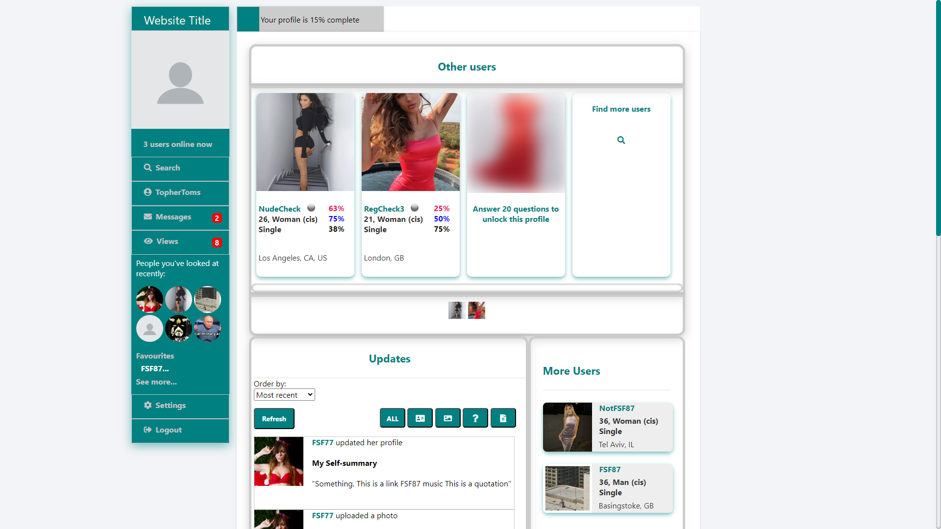
On the home page, you’re shown a selection of users who match your search criteria in the Other Users carousel along the top. And, yes, these users will match your search criteria. The site won’t ever show you users who are, for example, outside of your search radius (unless you specifically search for them).
Further down, on the right, we have even more users who match your search criteria.
In the main part of the screen, you will see updates from users who match your search criteria. These updates can be profile updates, photo uploads, questions answered, and blogs written. You can sort these updates by most recent, or by users who are closest to your location.
The Updates, I feel, helps with user engagement. Unlike apps that use deck of cards, you can see that users are active, that users are updating their profiles, that users are uploading new photos, that users are answering questions, and you can be confident that the users you see in Updates have been recently active, and that they’re not long abandoned profiles.
As well as this, it can introduce you to new people. If you see a dude who answered a question the way you like, you might want to check him out. And if you want some attention, just update your profile, and you will be on the home screen of users who are looking for people just like you.
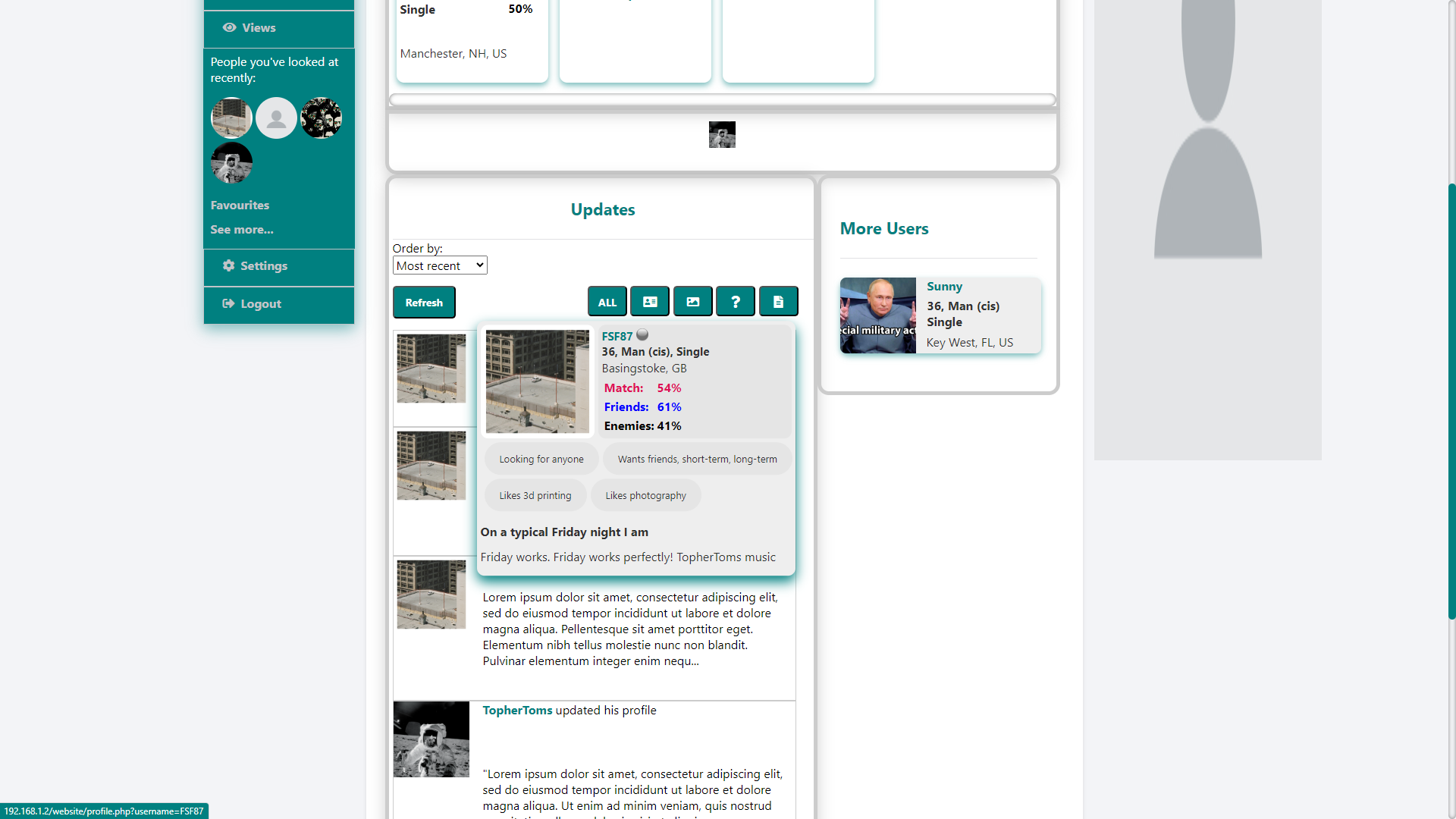
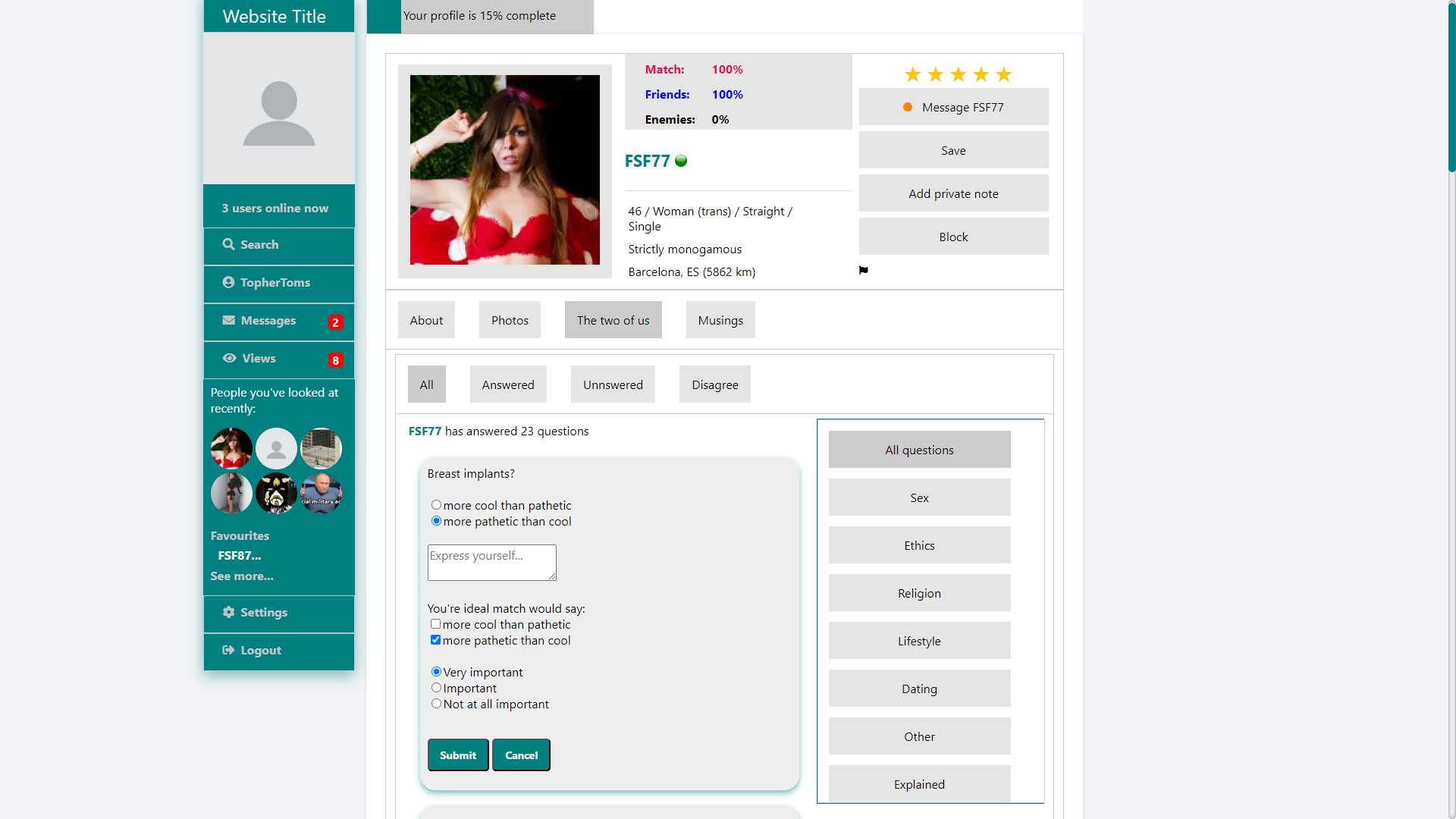
In the Updates section, if you hover over the user’s profile pic, you can see more details about that user, including their age, gender, status, and location, your Match, Friends, and Enemies ratings, what they’re looking for, some of their interests, and a little bit from a random section of their profile.
Where to start with the user profiles?
Firstly, you might notice that the theme has changed. This is irrelevant to profiles themselves, I just changed the theme between taking screencaps. Basically, if you don’t like teal (what is wrong with you?), you can have pink instead.
Back to the profile.
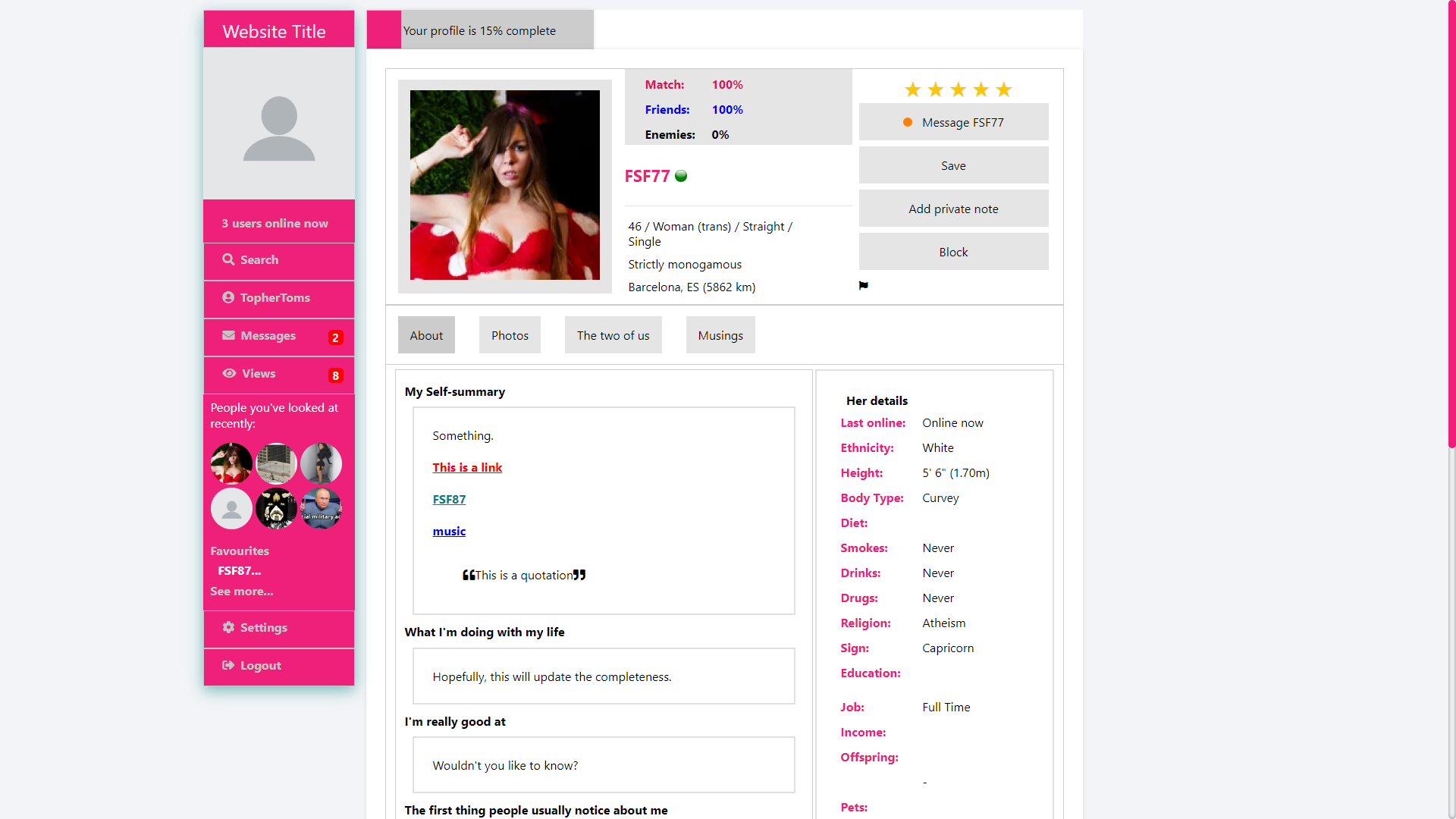
Along the top, there’s some of the information we saw earlier in the popup, and a bit more. Here, we also see orientation and monogamy preferences.
Next to all that, we see that you can rate users out of five stars. This is the closest thing the site has to a matching system. If you and a user both rate each other 4 or more stars, the site will let you both know. Even when this happens, only you can actually see what you rated a user. However, the site does average each user’s star rating, and premium members can sort search results by this metric.
Below that, we have the message button, which uses a traffic light system to tell you how likely a user is to respond to your message, with red being very selectively, amber being selective, and green being often.
Below that, you can add a user to your favourites, so you’ll know when your favourite users log on.
Below that, you can add private notes about the user that only you can see. This, I feel, can help you remember at a glance what you like or dislike about the user when you revisit their profile.
Below that, we have the block and report buttons (self-explanatory).
Now, onto the meat of the profile.
I wanted profiles that aren’t limiting like so many other dating platforms. The user can put as much or as little on their profile as they want. There are the nine prompts that used to be standard on OKC because they, I think, were perfect prompts, and users can fill in whichever of them they want. The only one that is mandatory is the ‘My Self-summary’ section.
Within each section of a user’s profile, they can use a markdown language that I created so they can format their profile with underlined, italic, bold, and struck through text (not shown), add external links, tag other users, add interests, and add quotes (shown).
Along the side, there are details about the user, like when they were last online (yes, you can see when users were last online), their height, ethnicity, and all that stuff. These have two purposes. Firstly, so you can learn more about the user you’re looking at. Secondly, these are all search criteria (yes, the site has a search feature)… or, at least, most of them are search criteria… I haven’t coded for all of them yet, but they will become search criteria when I can be bothered to add them to the search page.
Talking of searches.
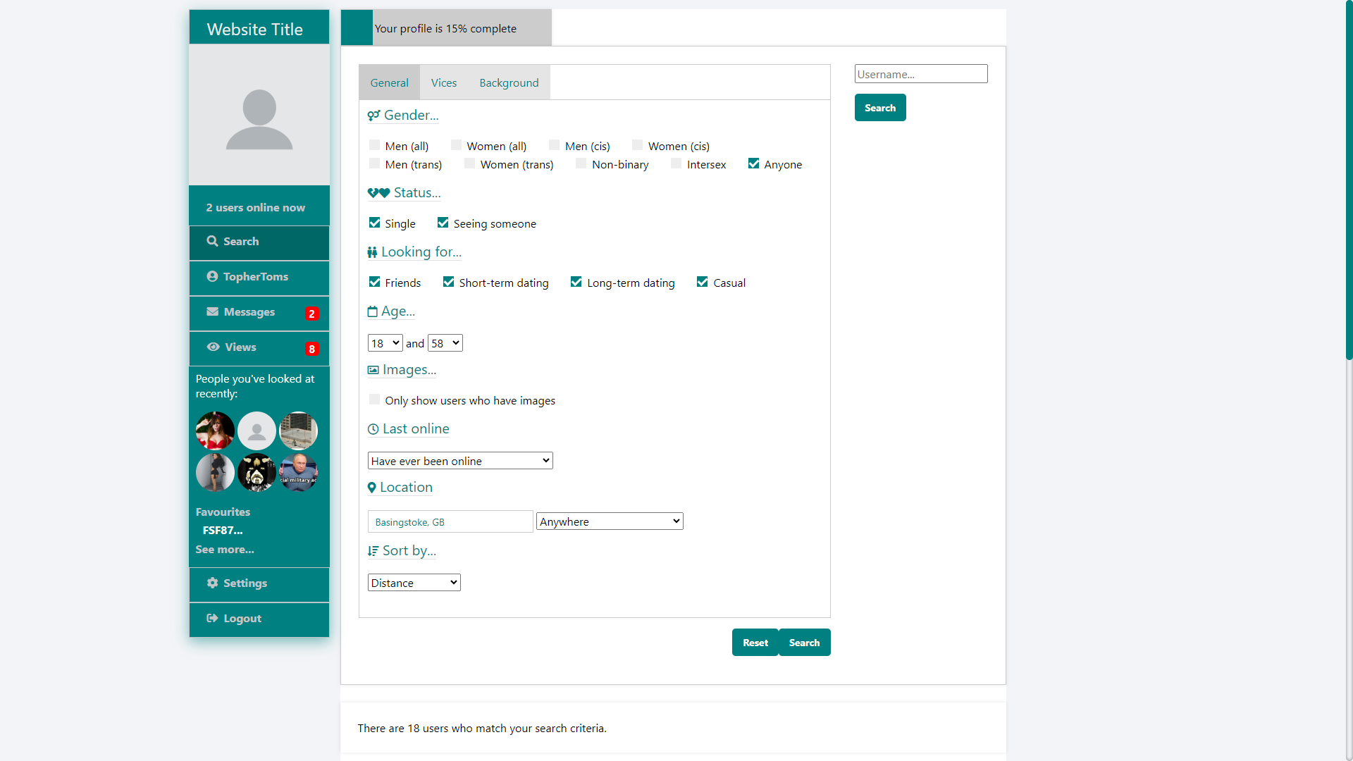
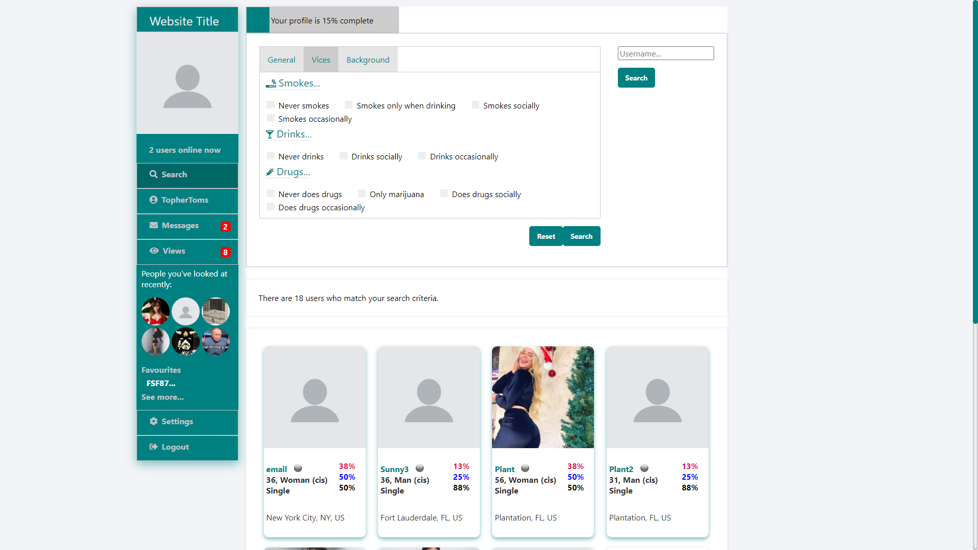
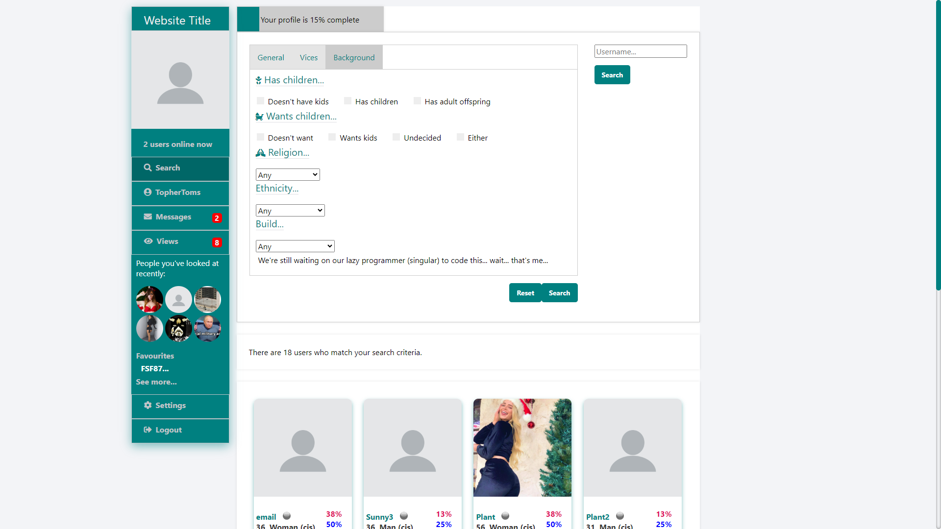
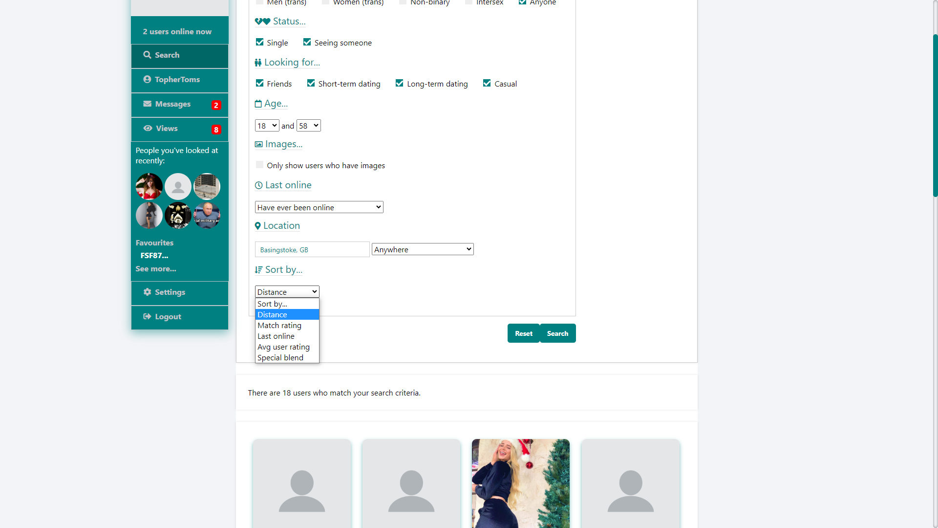
This should be self-explanatory. You select your criteria, select the metric by which you want results to be ordered, and click search. You can also search by username (top right).
I should point out that some of the search criteria (ethnicity and build) and order by options (avg user ratings (remember the five stars from earlier?)) will only be available for premium members.
I will also add an interest search at some point, so you’ll be able to type in interests and search for people who mention it on their profile. The backend is complete, so you can click an interest on someone’s profile, and it will do the search, I just need to add the text box to the search page (it’s harder than it sounds (I’ve been through three iterations, and I’ve not been happy with any of them)).
Once you’ve found someone you’re interested in, what do you do? You message them, of course.
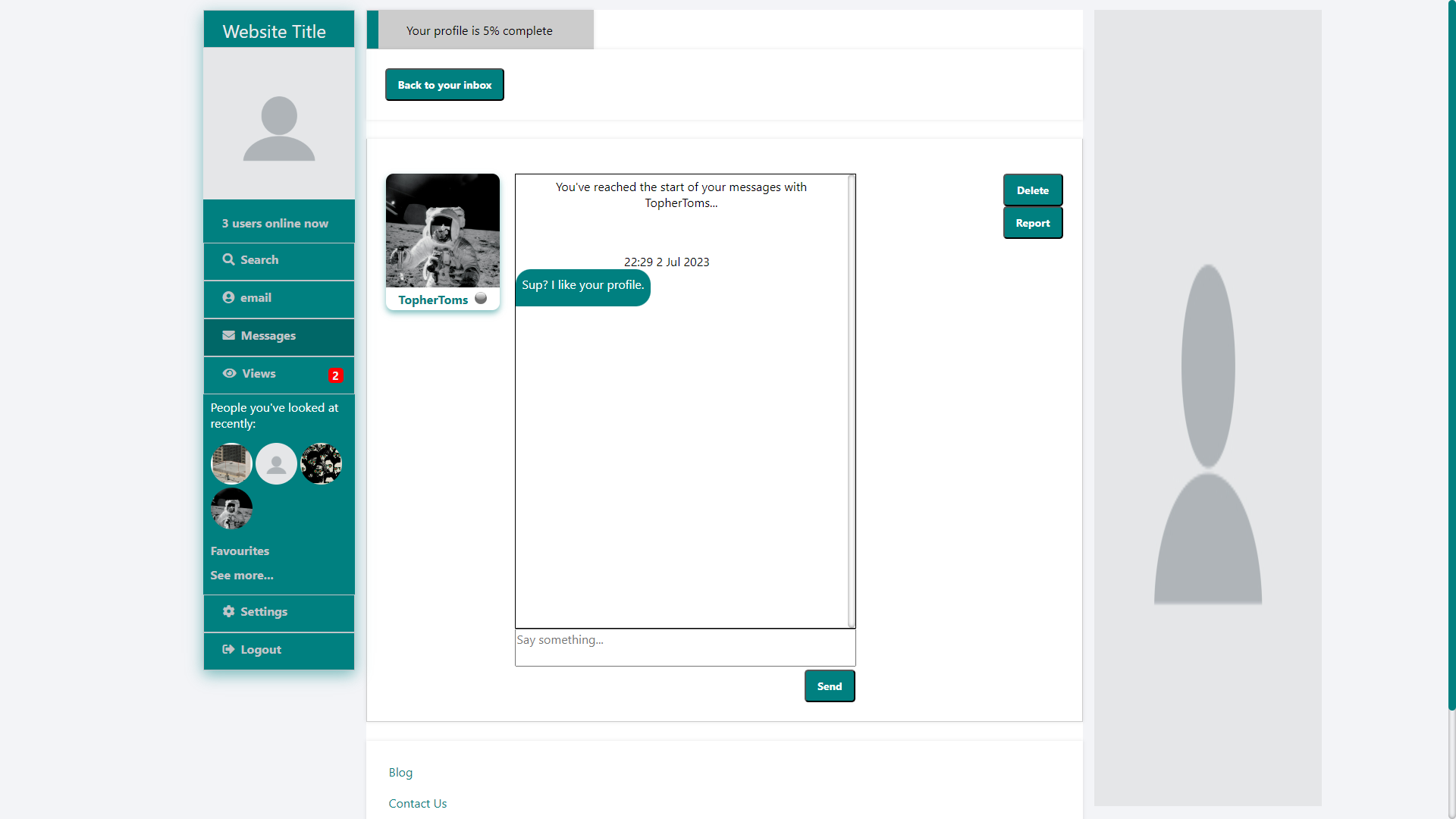
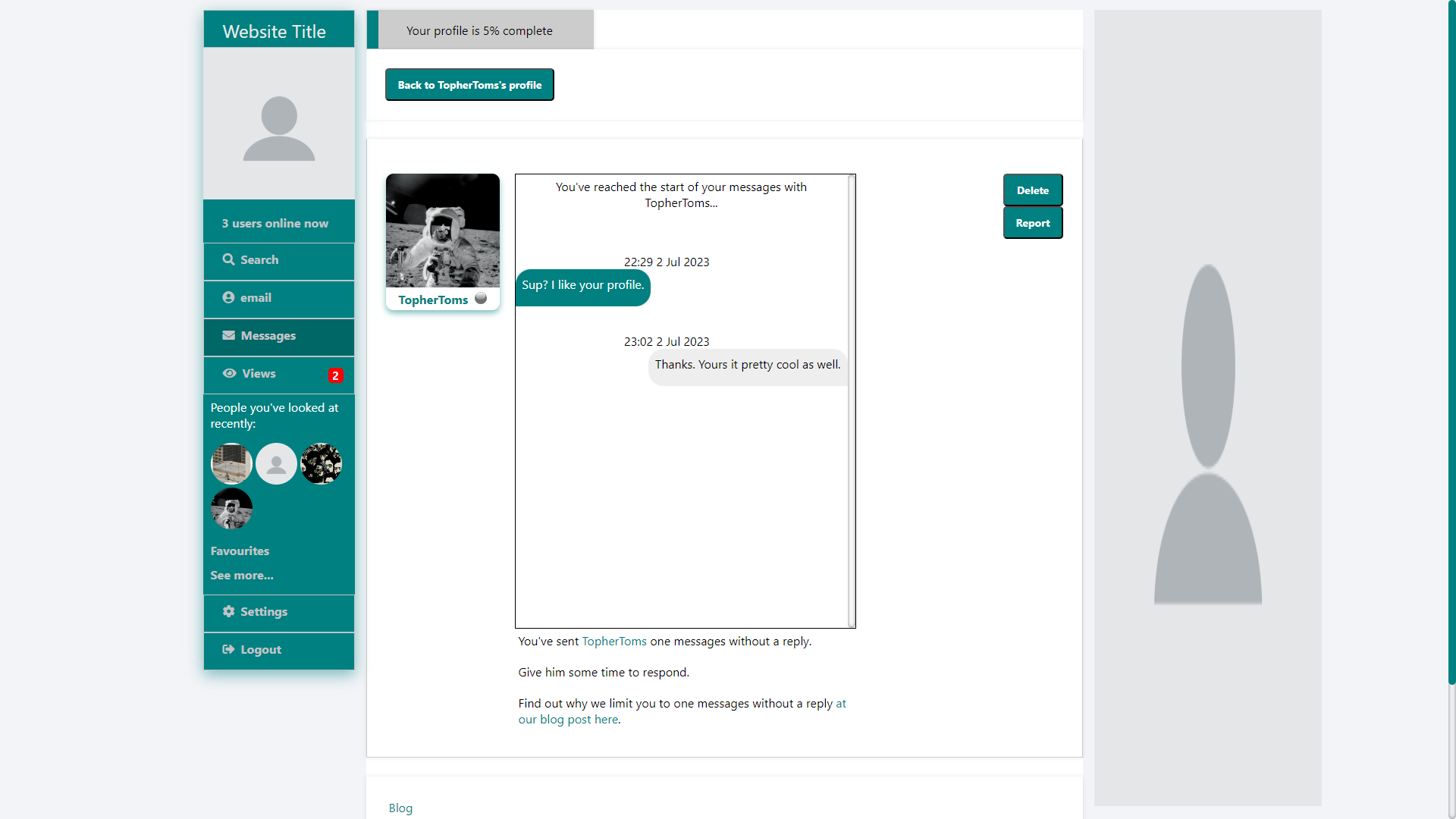
The site limits how many times you can message a user before receiving a reply. Initially, you can only send one message, but, as you complete your profile (yeah, that progress bar at the top of every page), you’re allowed to send two, and then three messages. Premium members can send four sequential messages. If either the sender or the recipient deletes a message, the count does not get renewed. It only gets renewed when the recipient replies. This is to stop messages from nuisance users who don’t know when to take the hint and will message you over and over and over again, even if you don’t reply.
Oh, and premium members get read receipts (not pictured).
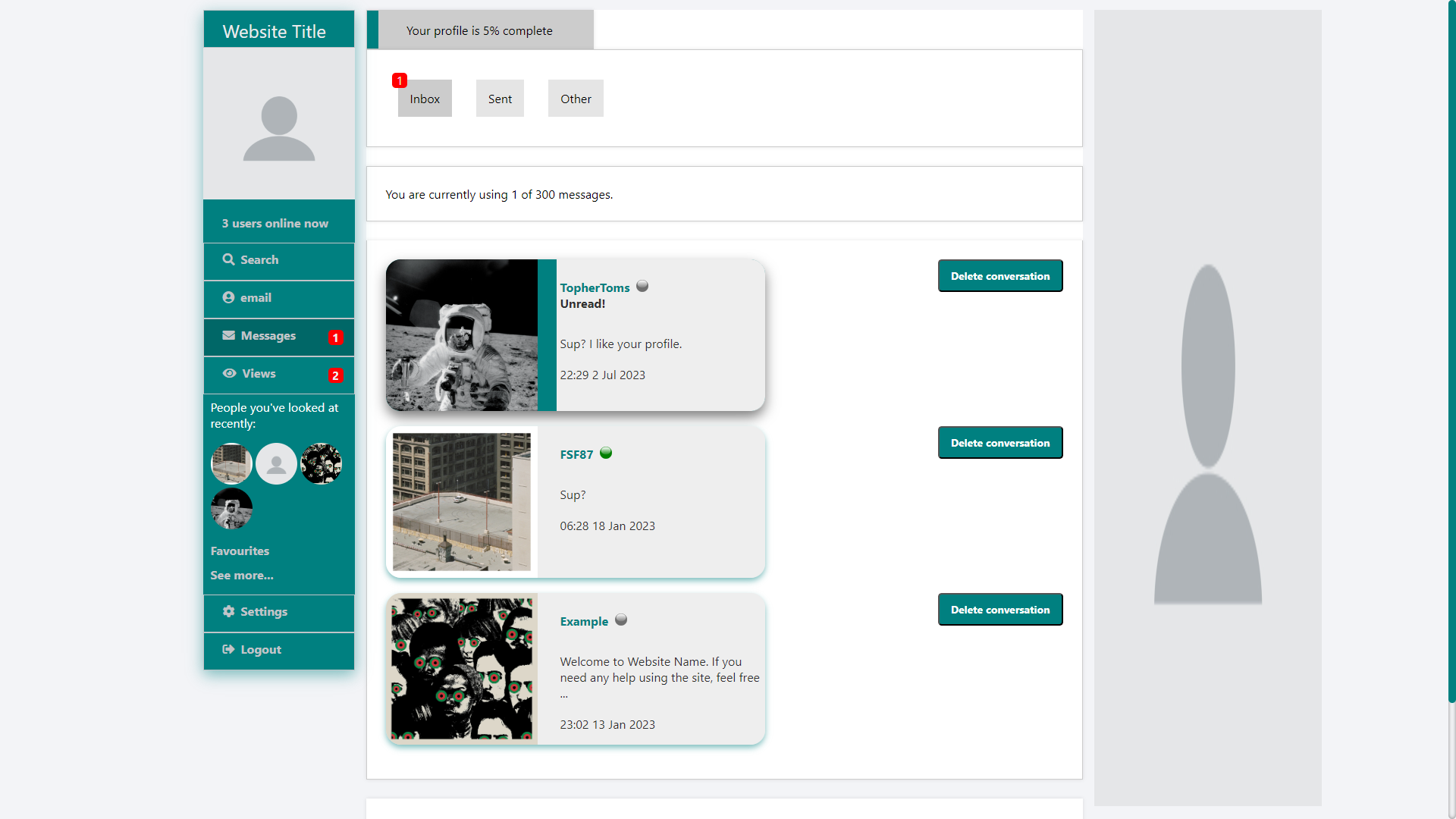
There are three message folders: inbox, sent, and other. Mostly self-explanatory. Inbox is for messages you received, sent it for messages you’ve sent, and other is for messages you receive from people who you don’t want to receive messages from (see below). If you reply to someone in your other folder, all their messages get moved to your inbox.
Inboxes are limited to 300 messages for free members and 3,000 for premium members. Premium members can also send messages to people who have full inboxes.
A little more on the other message box.
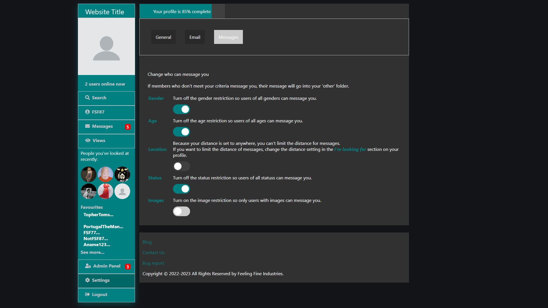
Ignoring the switch to dark mode (yes, the site has a dark mode), the site has message filters.
Say you’re flexible with age, just turn off the age filter and, when someone who’s older or younger than you’re looking for messages you, their message will appear in your inbox.
If you only want to receive messages from people who have profile pictures, just turn on that filter and, when someone without a photo messages you, their message will go to your other box.
So, how do you decide who to message? Match, Friends, and Enemies ratings, of course.
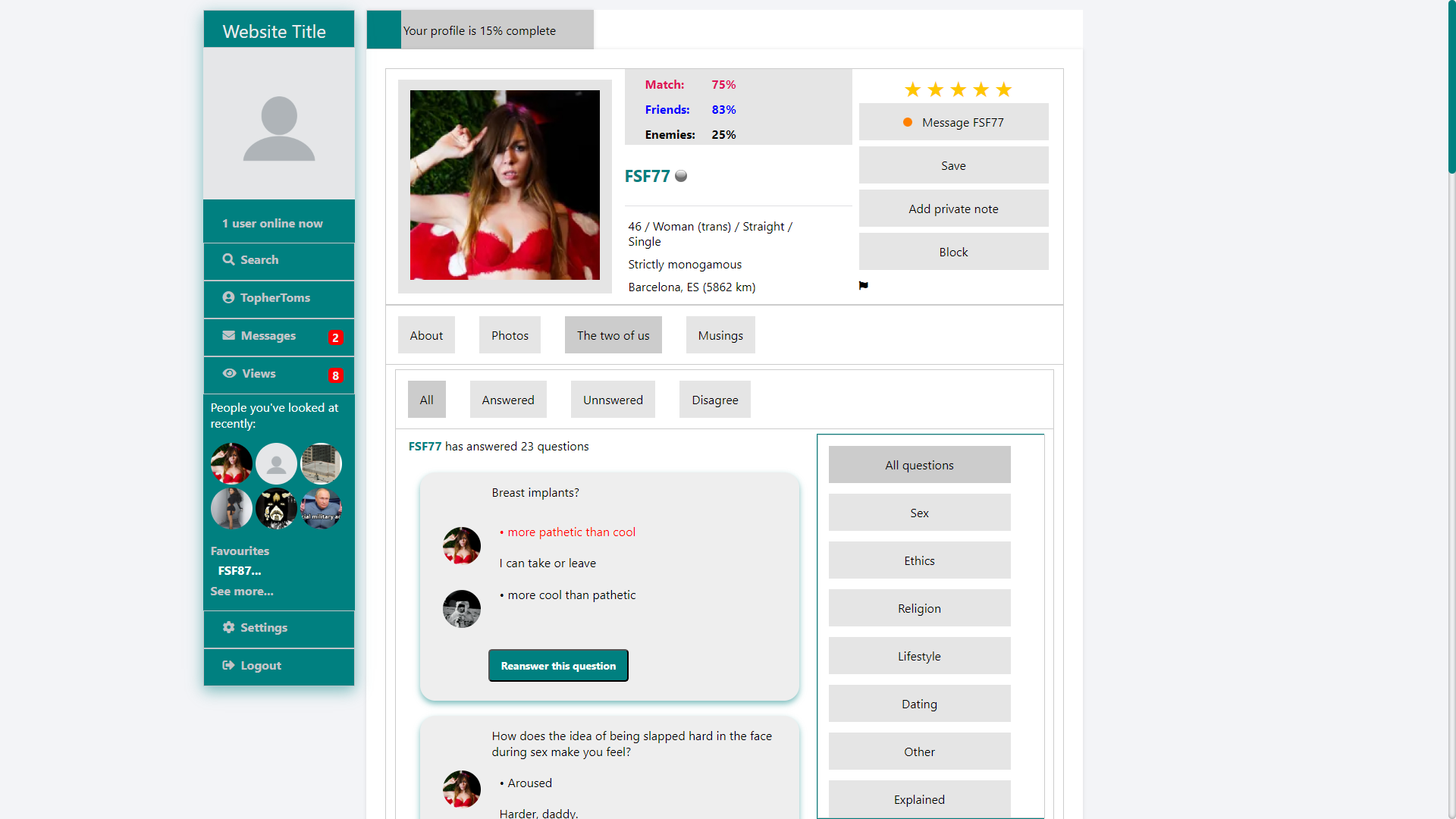
The Match, Friends, and Enemies ratings are based on the questions you both answer. It’s not just a random number like OKC seems to be now.
This is just a glimpse at what’s already done. There are still a lot of things I haven’t mentioned (blogs/Musings, photos, all settings, etc). And there’s still a lot that needs to be done (quizzes, personalities, finishing the search criteria, a mobile version, etc), but I figured I’d let the world known now.
If you have any suggestions (like a name for the platform) or questions, let me know in the comments below.